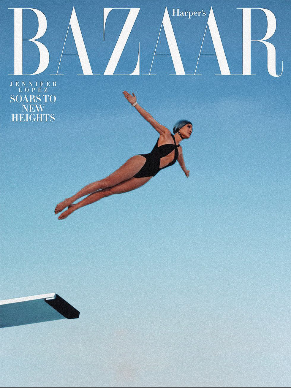
15 Jun Iconic Magazine Covers
by Carolina Marchiori
The decision is always made in a room. Not in the final image, not at the printing press, not in the distribution deal that places the issue on a particular shelf in a particular city. In a room where several people are looking at photographs and trying to agree on which one is the argument.
Because a magazine cover is not an image. It states — in the span of time it takes a reader to register it, which research confirms is under fifty milliseconds — what this publication believes is worth looking at right now, and why that looking matters. The argument is made before a word is read. It is made through light, proportion, gaze, colour, the precise millimetre of empty space at the edge of the frame.
This is why the decisions that seem superficial are not. The choice of a cover is the magazine’s most concentrated act of editorial intelligence. Everything that follows — the feature well, the advertising relationships, the cultural positioning of the publication — follows from the logic established on that front face. You can learn everything about what a magazine believes about its readers from how it treats the cover.
There are, broadly, two modes in which a cover can make its argument. The first is witness: the cover that documents a cultural moment so precisely that the document outlasts its occasion. The second is statement: the cover that speaks entirely through graphic conviction — through form, symbol, or concept — without relying on what the image records. Both require the same quality of editorial intelligence. What differs is where that intelligence is applied: to selecting the true image, or to constructing the true argument.
50ms
VISUAL RECOGNITION TIME BEFORE A WORD IS READ
8
VOGUE PRINT ISSUES PER YEAR FROM 2026
92
COVERS GEORGE LOIS CREATED FOR ESQUIRE, 1962–1972
No cover makes the statement mode more starkly than TIME’s April 1966 issue. No image. No photograph, no illustration, no face. Only three words in red type on a black ground: Is God Dead? It was the first cover in the magazine’s history to carry no image at all. The argument was the question itself. The decision to remove everything except the sentence demonstrated a precision that no photograph could have matched — that some questions are too large for the normal operations of the form, and that the most honest editorial response is sometimes the one that refuses to illustrate.
The New Yorker has made the same argument with equal precision, by different means. Françoise Mouly, art director since 1993, has kept the cover an illustration — always. In a media landscape that moved almost entirely toward photography, this is a position in itself: a drawn cover does not document a moment, it interprets one. The distinction matters because it defines what a publication believes about its relationship to reality. Not a record of what happened. A reading of what it means. The New Yorker cover does not ask: who was there? It asks: what does it look like from here?
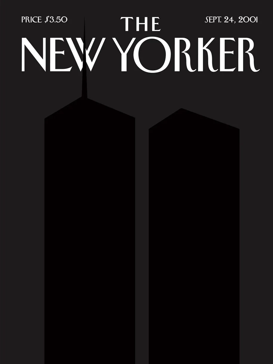
The most complete version of this argument was Art Spiegelman’s cover of September 24, 2001. Inspired by Ad Reinhardt’s black-on-black paintings, Spiegelman and Mouly printed the Twin Towers in a slightly darker shade against a black ground — visible only at certain angles in certain light. One detail was of extraordinary precision: the north tower’s antenna broke through the magazine’s own logo, a few millimetres of absence making the loss architecturally specific. No headline. No explanation. The argument was that some moments exceed the normal operations of the form — that the most precise editorial response is sometimes the one that refuses to compete with the images already saturating the world and chooses instead to make silence visible. That cover did not show the event. It showed what the event had done to looking.
The cover is not decoration. It is the magazine’s claim
about what the cultural moment requires —
stated once, in a single frame, without commentary.
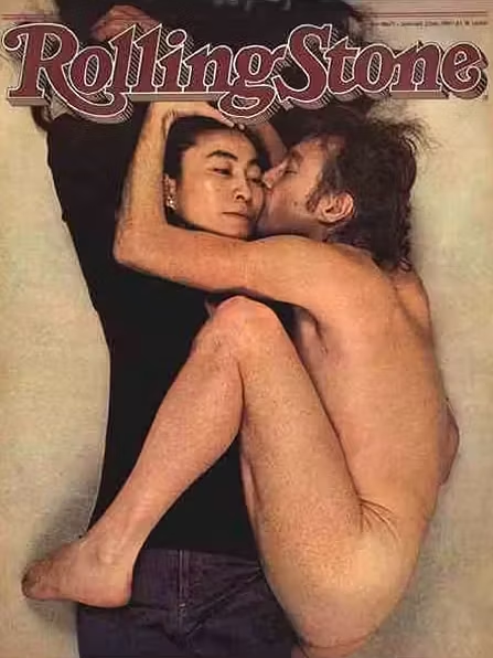
The witness mode operates differently. Here the argument is not constructed — it is found. Annie Leibovitz photographed John Lennon curled against Yoko Ono for Rolling Stone in December 1980, hours before his death. The image was an argument about their relationship: his vulnerability, her composure, the particular quality of how he looked at her. It became something else. But what made it last is what made it true when it was taken — the argument was precise enough to hold under the weight of what came after. LIFE’s moon landing coverage belongs to the same tradition. The magazine that existed to bring photographs of the world to Americans who could not see it in person met its defining moment when the world itself exceeded imagination. The LIFE cover does not argue. It witnesses. And the act of witnessing at that scale, at that moment, becomes its own argument: that the image is the proof. That it happened because we can see it. That the camera was there.
The distinction matters because it clarifies what the room is deciding. In the witness mode: which image is truest to what occurred. In the statement mode: what formal or symbolic choice is precise enough to hold the meaning. Both require a willingness to commit. The room that hedges — that chooses the beautiful image over the true one, or the safe concept over the precise one — produces a cover that disappears.
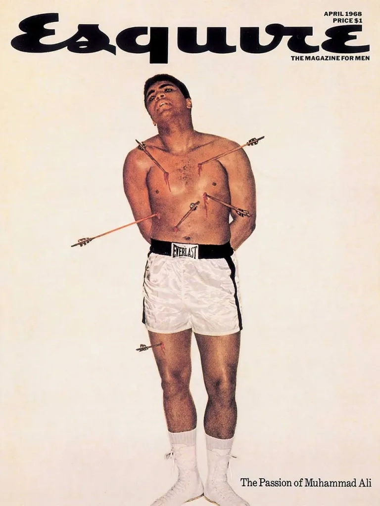
Esquire under Harold Hayes and art director George Lois in the 1960s treated the cover as a polemical object — a compressed argument delivered at the newsstand before a single article was opened. Muhammad Ali posed as Saint Sebastian, arrows of the Vietnam draft piercing his body. Andy Warhol drowning in Campbell’s soup. These were not illustrations of the culture. They were arguments about it. What distinguished them was not craft. It was conviction — the willingness to state a position in a single frame and hold it, regardless of whether the reader agreed.
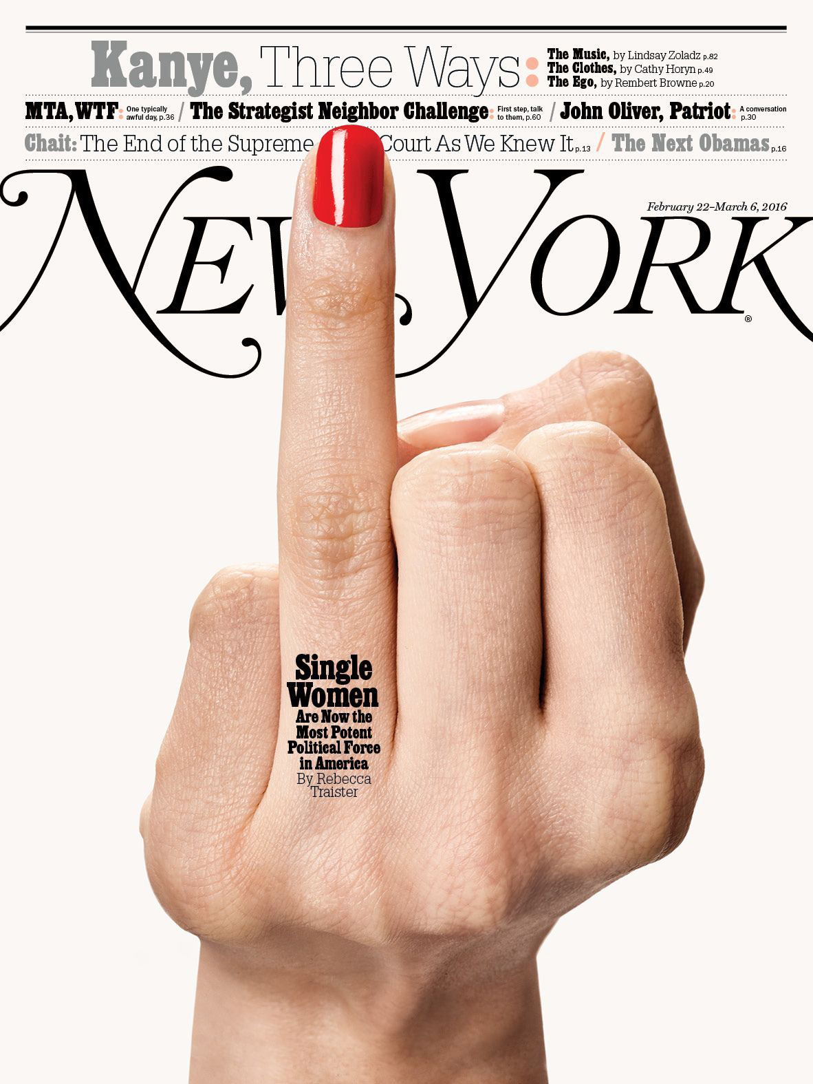
That same instinct produced one of the most precise covers of the following decade: New York Magazine’s February 2016 issue. A single hand against a white ground, middle finger raised, red nail lacquered to exactness. The headline reads: Single Women Are Now the Most Potent Political Force in America. The image has already said it. What makes the cover extraordinary is the nail — a detail that is simultaneously feminine, composed, and entirely unambiguous. The gesture is not protest as anger. It is protest as posture. The editorial argument is so specific it could not have been made any other way: this is what political power looks like when it decides not to perform itself for you.
The same instinct had driven Vogue to commission Salvador Dalí to paint its covers in the 1940s. Not because his surrealist vocabulary was commercially safe — it was not — but because the magazine understood that the cover is the point where artistic and editorial intelligence are indistinguishable. The French journal Verve, which ran from 1937 to 1960, had established this even earlier — commissioning original covers from Matisse, Picasso, Braque, and Chagall. Art critic John Russell wrote that Matisse’s first Verve cover “sang out from the other side of the street in a way that made us run across the road to look at it more closely.” That is still the criterion.

Vogue announced in early 2026 that it would move to eight print issues a year. Each one thicker. Each one built around a cultural moment rather than a routine monthly slot. This is, commercially, a response to the economics of print publishing. It is also, culturally, something more precise: a recognition that rarity amplifies argument. If the cover appears twelve times a year, it carries the weight of the monthly schedule. If it appears eight times, each appearance carries the weight of selection — the implicit claim that this particular moment is significant enough to merit a print object. The print magazine is not dying. It is becoming something it perhaps always should have been: a rare, premium object that can hold cultural weight precisely because it does not appear constantly.The covers that fail are almost never the ones that tried something wrong. They are the ones that tried nothing — that filled the format without making the argument. That treated the cover as a surface rather than a sentence. The room that agrees on the beautiful image instead of the true one produces a cover that disappears by the following month, leaving no trace of what the publication believed about the world at that particular moment in time.
The skill required to make that argument in a single frame is not graphic design. It is not photography. It is the specific ability to read a cultural moment and give it a face — or, when the moment requires it, to give it the precise absence of one.
The cover is almost never chosen because it is the most beautiful image. It is chosen because it is the most legible argument. The image that tells a reader, without words, what this publication is thinking — and whether that thinking is worth her time.
REFERENCES AND SOURCES
- Thorpe, S. J. et al. — Speed of processing in the human visual system, Nature, 381, 520–522, 1996
- Spiegelman, A. & Mouly, F. — The New Yorker, September 24, 2001
- Lois, G. — Muhammad Ali as Saint Sebastian, Esquire, April 1968
- Lois, G. — Andy Warhol Drowning in Campbell’s Soup, Esquire, May 1969
- Leibovitz, A. — John Lennon & Yoko Ono, Rolling Stone, January 1981
- Penn, I. — Vogue cover, June 1950
- TIME — Is God Dead?, April 8, 1966
- New York Magazine — Single Women Are Now the Most Potent Political Force in America, February 22, 2016
- LIFE — To the Moon and Back, Special Edition, 1969
- Russell, J. — on Matisse’s first Verve cover, 1937, cited in PRINT Magazine
- Condé Nast — Vogue Print Schedule Announcement, January 2026
- Barthes, R. — Image, Music, Text, Hill and Wang, 1977
- Sontag, S. — On Photography, Farrar, Straus and Giroux, 1977