FLAIR MAGAZINE


Flair is a premium women’s monthly published under license from Mondadori — one of Europe’s largest and most editorially rigorous media houses. The German and Austrian edition brought that standard to a new market, with all the demands that implies: 178 pages monthly, a full production apparatus, and the expectation that every cover, every spread, and every editorial concept would hold its own against the Italian original.
This is where the discipline of editorial art direction was built — not in theory, but in the pressure of a monthly production cycle at international scale.
Art direction & editorial design. Flair Magazine Germany / Austria — 2013–2015.
The Situation
A Mondadori license is not a template. It is a standard.
Flair Italy had been defining a certain register of European women’s publishing for decades — sophisticated without severity, fashion-forward without exclusivity, visually intelligent without being cold. The German and Austrian edition carried that standard into a different market, a different language, and a different editorial culture.
The challenge was not translation. It was equivalence. Every cover had to hold. Every spread had to carry. Every editorial concept had to function at the level of the source — not as imitation, but as a genuine expression of the same visual intelligence in a different context.
The Reading
Monthly magazine production at 178 pages is an education in what editorial design actually is — as distinct from what it looks like in theory.
A spread works or it doesn’t. A cover sells or it doesn’t. A typographic decision that reads beautifully in isolation can collapse under the weight of an image, or rescue an image that would otherwise be ordinary. These judgements happen fast, under pressure, with a full production apparatus — graphic artists, contributors, lithographers — depending on them.
Flair was the environment in which the core vocabulary of editorial art direction was developed and tested: the relationship between image weight and white space, between typographic rhythm and photographic movement, between the singular strong cover and the accumulated coherence of an issue read as a whole.
The Decision
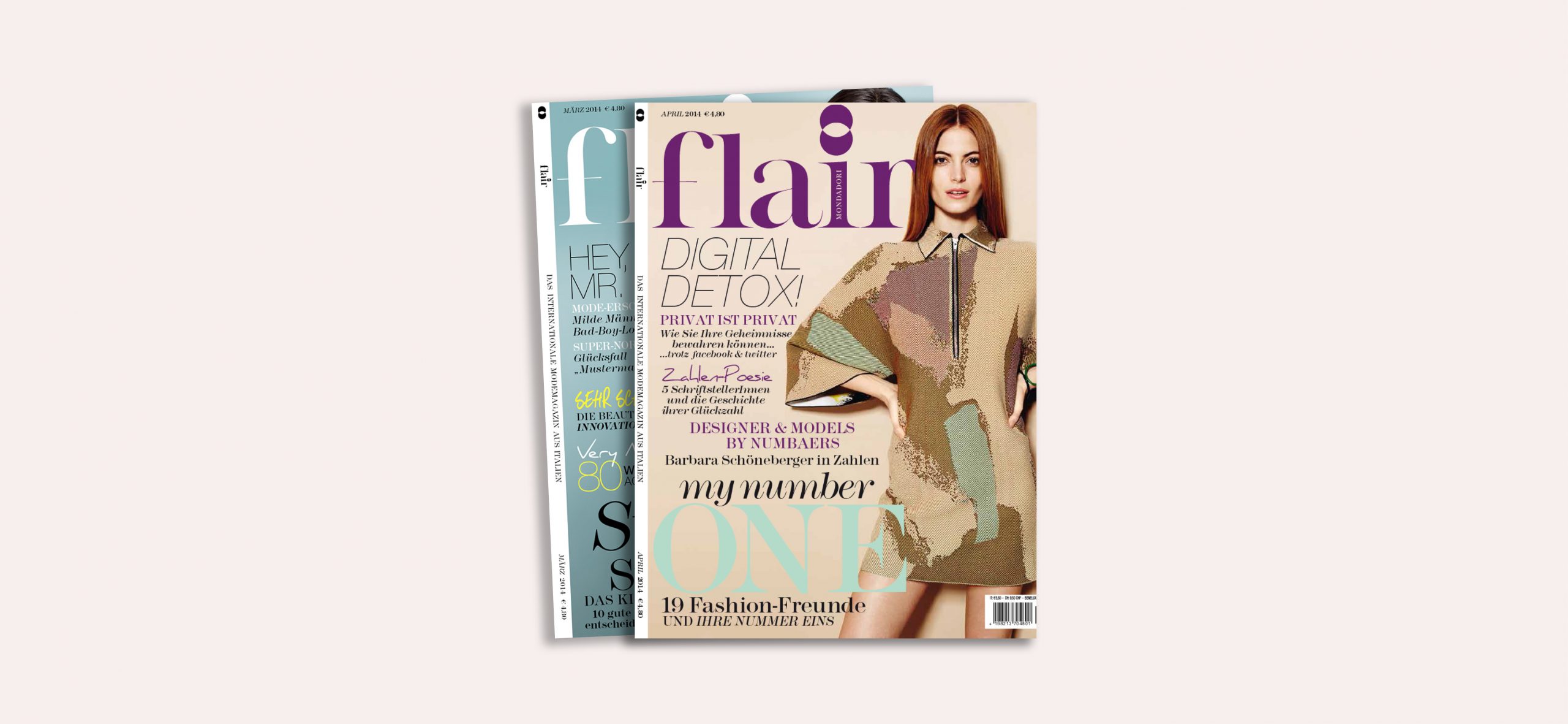
The defining decision on every issue was the cover — and behind every cover, a prior decision about what the magazine believed that month.
A cover is not a photograph with text on it. It is a position. It says: this is what we think is worth looking at, this is the register we are working in, this is the reader we are speaking to. Getting that right — consistently, monthly, under deadline — is the work that builds editorial instinct.
The concepts developed for Flair’s German and Austrian editions were not adaptations of Italian originals. They were original editorial propositions that met the same standard from a different angle. That distinction — between meeting a standard and copying a solution — is where genuine editorial intelligence develops.
The Work
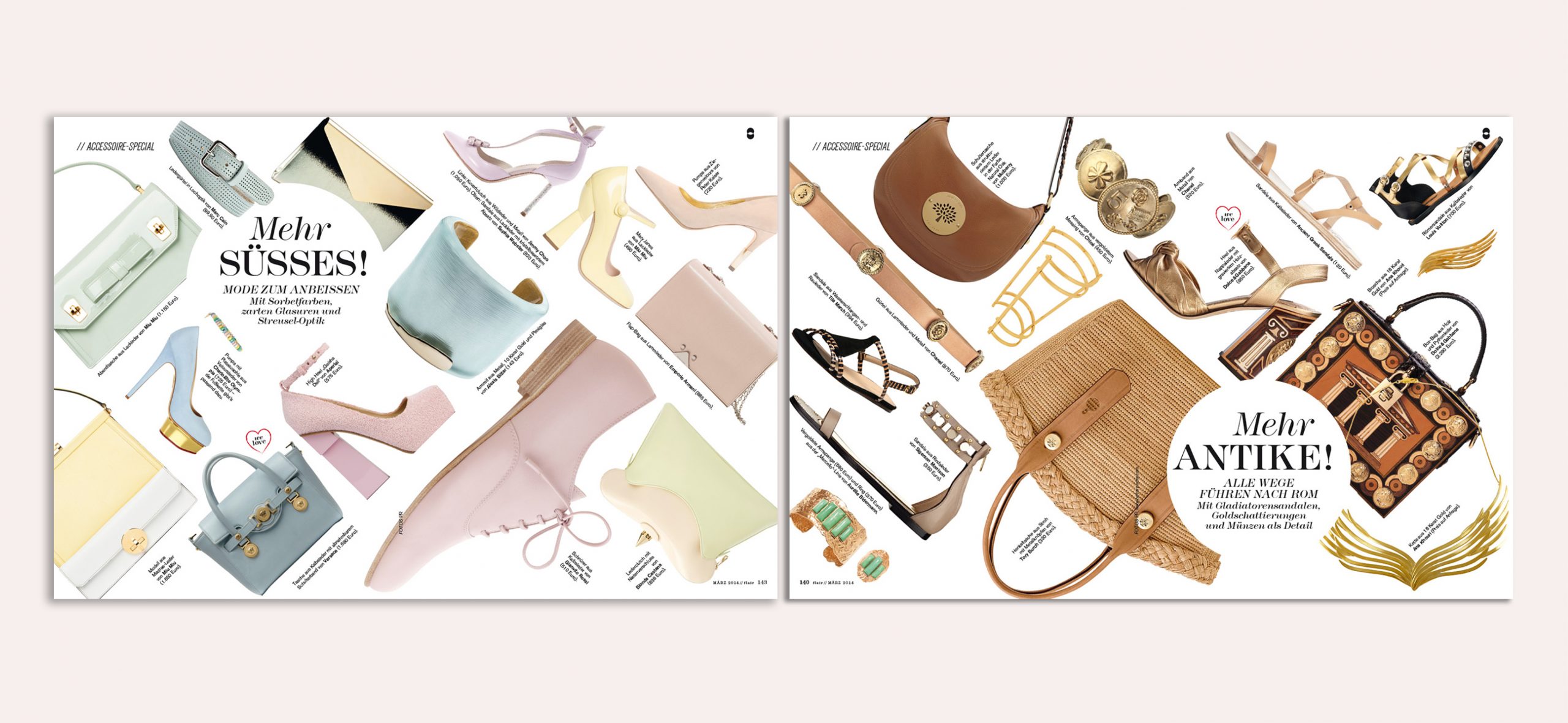
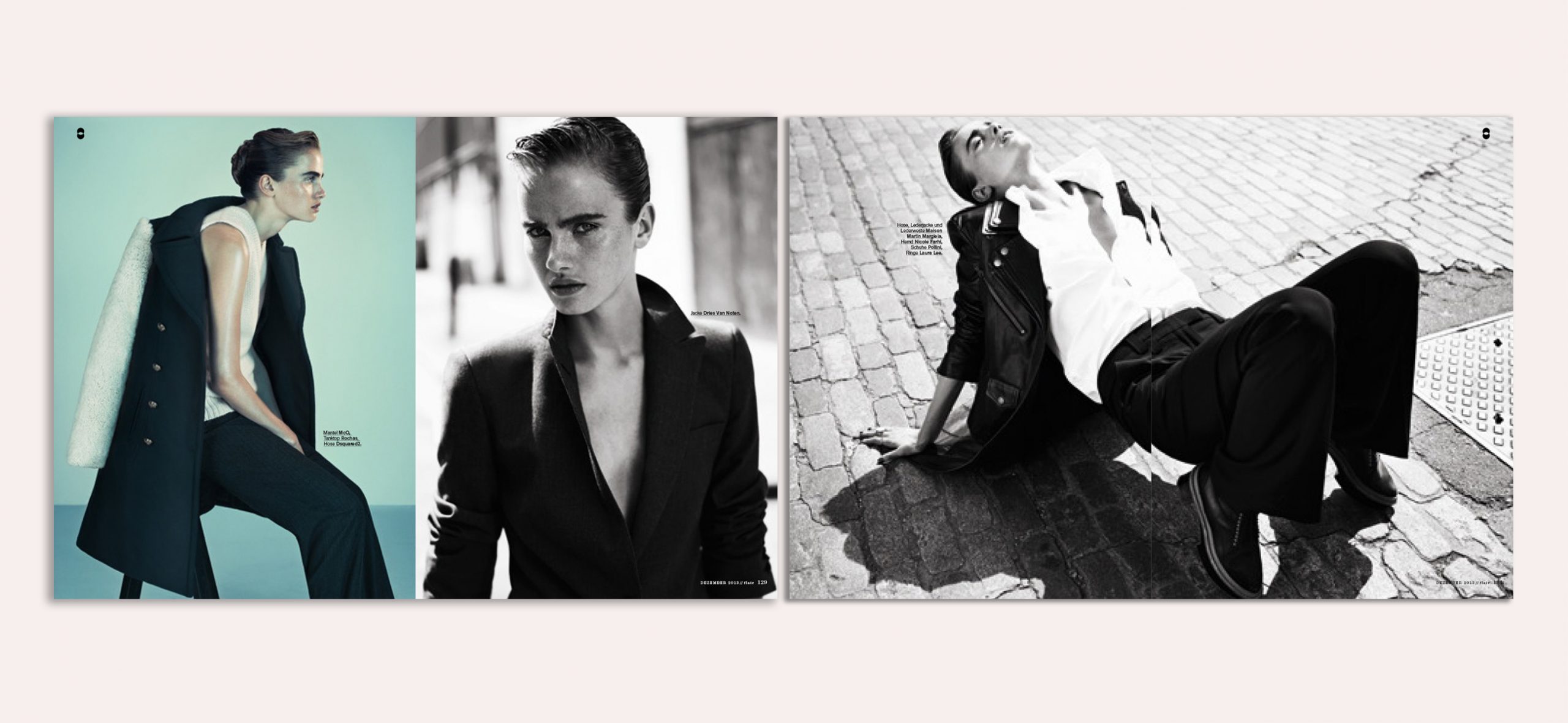
Art direction and editorial design across monthly issues of Flair Germany / Austria. Cover concept and direction. Full 178-page layout production — managing graphic artists, editorial contributors, and lithographers. Typography system maintenance and development within Mondadori’s editorial framework. Visual identity consistency across all sections — fashion, beauty, lifestyle, culture. Newsstand visibility strategy through cover design and typographic hierarchy.
The Shift
Two years of monthly production at this scale builds something that cannot be taught in a studio: the ability to make editorial judgements quickly, accurately, and consistently — and to maintain a visual standard across hundreds of pages and dozens of contributors without losing the thread.
The German and Austrian edition of Flair reached the visual level of its Italian source material. Not by replication — by understanding what made that standard work, and finding an equivalent expression in a different editorial culture.
That understanding — of how editorial intelligence operates at international scale — is what every subsequent project has drawn from.
Date
August 08, 2013