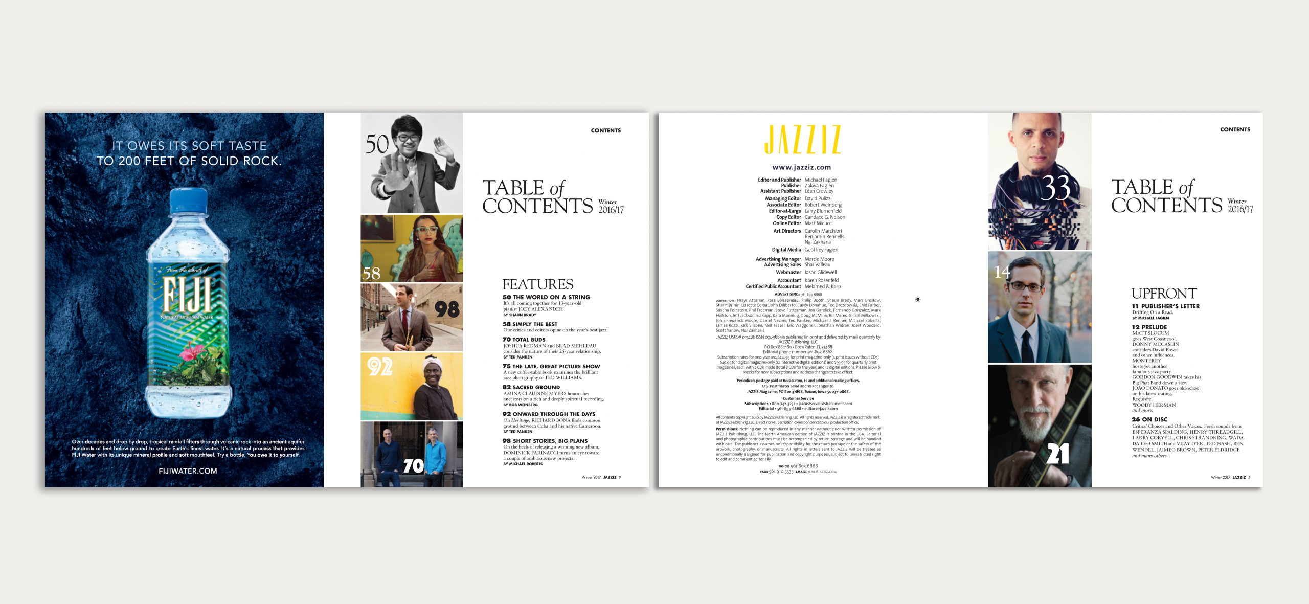
JAZZIZ MAGAZINE


JAZZIZ is a Miami-based quarterly dedicated to the international jazz and blues scene — a publication with genuine cultural authority built over decades of deep engagement with a readership that knows the music better than almost any audience a magazine can address. In 2016, the brief was to redesign it. The risk was not getting the design wrong. The risk was getting it right in the wrong way.
THE SITUATION
Redesigning an established special-interest publication is one of the most structurally constrained commissions in editorial design. The audience is not general. They are specific — knowledgeable, loyal, and acutely sensitive to changes that signal a misunderstanding of what they value. A jazz reader who has followed JAZZIZ for fifteen years is not waiting to be impressed by contemporary typographic fashion. They are watching to see whether the redesign understands what the publication is actually for.
The conventional response to this constraint is cosmetic modernisation: adjust the palette, update the typefaces, improve the grid — enough change to signal renewal, not enough to disturb the existing readers. This produces publications that look like they have been gently updated, which is precisely what a design-driven publishing category cannot afford to be. The improvement is visible. The thinking behind it is not.
JAZZIZ needed to be genuinely contemporary — not in the sense of following current design conventions, but in the sense of reflecting the current state of music journalism and of the visual standards its readership encounters everywhere else they read. A 130-page quarterly competing for attention against international music and culture titles cannot afford to look like a slightly newer version of itself. It needed to look like it had decided what it was.
THE READING
Jazz as a musical culture is built around a specific and productive tension: between the standard and the improvisation, between the inherited form and the individual interpretation. Every jazz performance begins with a known structure — a chord sequence, a melody, a rhythm — and proceeds by finding within that structure a new and unrepeatable relationship. The form is not abandoned. It becomes the condition of possibility for something that did not exist before.
This is not a metaphor to be applied to a magazine redesign. It is a structural description of what good editorial redesign actually does. The existing publication’s authority — its decades of credibility within the jazz community, its readership’s trust, its established position in music journalism — was not a constraint on the redesign. It was the form that made the redesign possible. The task was to find within that inherited structure a visual language that was both entirely contemporary and entirely coherent with what JAZZIZ had always been.
A redesign that abandons the form destroys the authority. A redesign that merely adjusts the surface preserves the form without activating it. The readable version — the one the JAZZIZ audience would accept as an evolution rather than a replacement — had to do what the music does: take the standard and play it differently, without pretending the standard does not exist.
THE DECISION
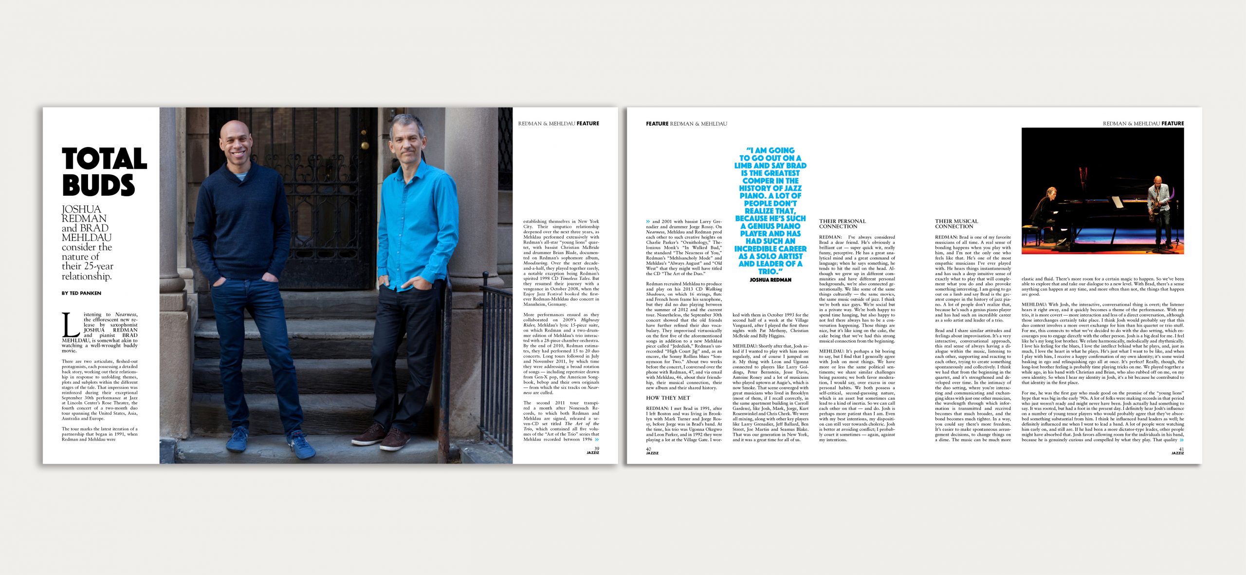
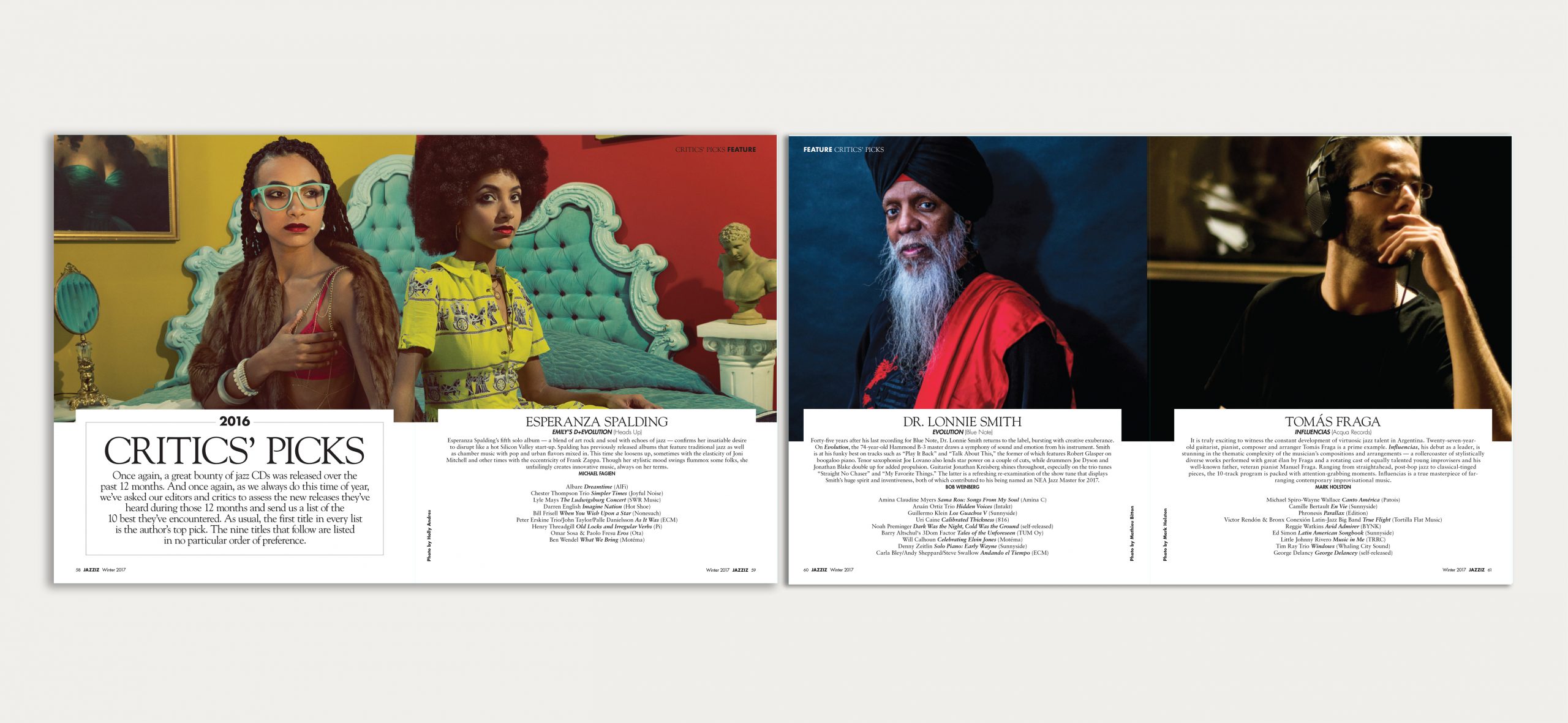
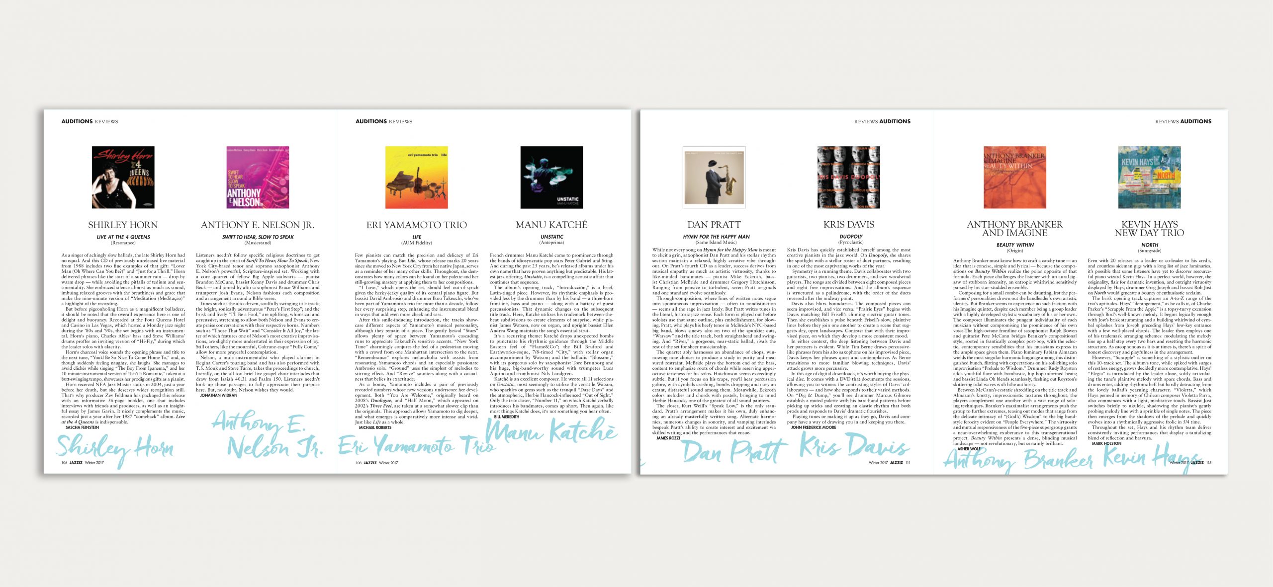
The central decision was typographic and hierarchical simultaneously: to establish a clearer, more disciplined visual system that could carry the editorial depth of 130 pages without losing momentum. Jazz journalism is long-form. The interviews run deep. The critical writing is substantive. A visual system that cannot sustain this — that privileges image over text, that fragments the reading experience into visual episodes — fails the content it is supposed to serve.
The redesign built its hierarchy around readability and pace: a typographic framework rigorous enough to hold long-form critical content without monotony, flexible enough to allow the visual differentiation between a new release review and an extended artist portrait. The structure became the foundation from which the visual language was allowed to be contemporary — because a clear grid and a disciplined type system are what make contemporary design choices legible rather than decorative.
The modernisation was real, not cosmetic. But it was earned by structural thinking, not applied over the top of it.
THE WORK
Full editorial redesign of JAZZIZ quarterly in collaboration with the editorial team. Typographic system, visual hierarchy, and grid architecture across 134 pages. Structural redefinition of section logic and content pacing. Contemporary design framework calibrated to the publication’s existing cultural authority and readership expectations.
THE SHIFT
The redesigned JAZZIZ reads as a premium publication within international music journalism — not because it adopted the visual conventions of premium publishing, but because it built a visual system with the same rigour and depth that its editorial content demands. The readership, who know immediately when something is wrong, did not find something wrong. They found something better.
Redesigning a beloved publication is the discipline of earning change. Every decision must be justified by the content, by the reader, and by the culture the publication exists to serve. When the justification is sound, the change does not feel like a departure. It feels like an arrival.
Date
Oktober 02, 2016