10 Jun Please Judge the Book by Its Cover
by Carolina Marchiori
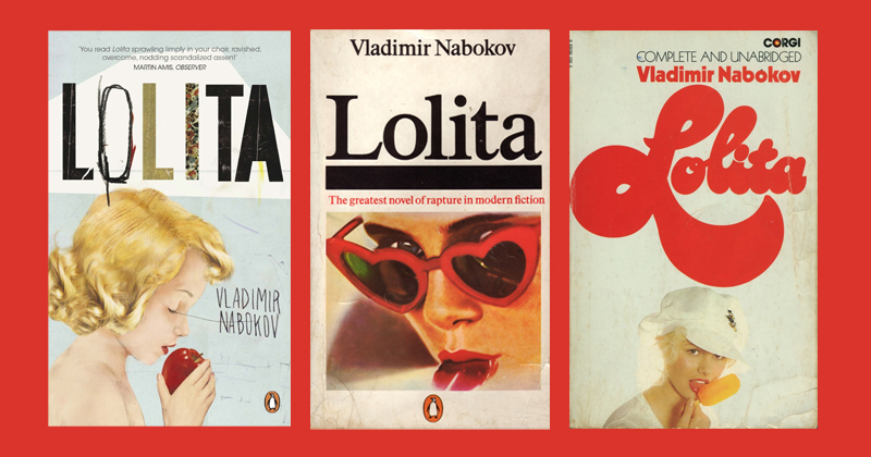
The covers don’t agree on a decade, a style, or a designer. One is painterly, its palette warm and soft, the girl’s eyes downcast over a bright red apple. One is photographic, its face filtered through a pair of heart-shaped red sunglasses, a tongue extending with a candour the eyes refuse. One is typographic, the title rendered in voluptuous script that is itself almost edible, a popsicle held at the mouth’s edge. They span roughly thirty years of cover design, three different publishing houses, three entirely different visual vocabularies. They agree on something more precise than style.
Each one places an object at or near a mouth. Each one uses red as its dominant key. Each one frames a girl who reads as young, whose hair is blonde, whose expression sits in the particular territory between innocence and something the designer knew the reader would supply. The consistency is not coincidental. It is the novel dictating its own visual translation — the same structural problem solved three times, by three different people, arriving at the same answer.
1955
FIRST PUBLISHED, OLYMPIA PRESS, PARIS
60+
LANGUAGES & EDITIONS WORLDWIDE
3
ORAL OBJECTS ACROSS THE ICONIC COVER DESIGNS
The novel’s central mechanism — what makes it one of the most formally disturbing things in twentieth-century fiction — is Humbert Humbert’s prose. Nabokov gives his narrator a voice of such devastating elegance that the reader is seduced before fully understanding what they are being seduced into. The language is beautiful. The situation is not. The beauty is doing the work of concealment — which is to say: the beauty is doing the work of the predator. By the time the reader recognizes what is happening, they have already been made complicit in the looking. The novel performs the crime of its narrator through the act of reading itself.
The covers understand this. Not as literary criticism — they predate most of it — but as visual intelligence. The apple is doing what the apple has always done: it carries Eve’s knowledge and Snow White’s sleep in a single image, collapsing temptation and innocence into the same bitten curve. Red nail polish catches the eye first, then the apple’s skin, then the girl’s parted lips. The hand and the fruit and the mouth form a sequence the eye follows without being asked to. The popsicle is less ambiguous and more direct — the oral gesture stripped of its mythological symbolism and left as pure appetite, the flavour communicated entirely through temperature and colour. The red sunglasses filter everything through desire; the tongue is the body’s refusal to maintain the composure the face performs. Each object is chosen for the same reason: it places appetite in the body of someone who is supposed to be innocent, and it makes that placement look like a natural pose.
The covers don’t show you what happens.
They show you how it happens — the mechanism of Humbert’s gaze
translated into visual grammar before a single page is turned.
The blonde hair is doing its own work. In Western visual culture, blonde carries the code for a very specific kind of visibility — simultaneously marked as vulnerable and as desired, as innocent and as available. It is a construction with a long history, running from Pre-Raphaelite portraiture through Marilyn Monroe and into the advertising vocabulary of the twentieth century. The Lolita covers are not using it carelessly. They are using it because it is the most compressed way to signal what Nabokov’s novel is actually about: the way desire projects innocence onto its objects in order to believe what it wants to believe. Dolores Haze is a child. The blonde is Humbert’s invention. The covers are showing you the invention, not the child.
The red is the only honest element in the composition. Red does not pretend. In each version it carries the full weight of what the other elements are performing — temptation, heat, the specific danger of being too visible in the wrong room. It is the colour of the apple’s skin and the popsicle’s flavour and the sunglasses’ lens. It is the opening temperature of the novel’s first sentence. The girl is always holding something red or wearing something red or biting into something red. The colour doesn’t describe her. It describes the looking.
This is what great literary cover design does at its most precise: it does not illustrate the book’s content. It embodies the book’s register. The Lolita covers don’t show you a scene, a character, a plot point. They show you the quality of attention the book demands of you — the particular way you will be asked to look, and the particular discomfort of discovering that you can. You already know, looking at the cover, that what follows will be beautiful and wrong in equal measure. The cover has already made you look the way Humbert looks. It has already done the thing the novel is about.
The question the cover does not answer — the one Nabokov’s novel also refuses to answer — is whether the design is a critique of that gaze or a continuation of it. The Penguin cover with the apple makes the girl look like a painting; the aestheticisation is part of the argument. The popsicle cover is more knowing, the commercial directness almost a parody of what it depicts. The sunglasses cover is the most self-aware — the prop from the novel used as a visual pun that collapses into genuine unease the longer you look. All three hold the contradiction without resolving it. That is not a failure. That is the point.
The cover that resolves the tension — that comes down firmly on the side of critique, or firmly on the side of beauty — is the cover that lies. What Nabokov understood, and what his best cover designers understood without being told, is that the novel’s power comes from the refusal to make looking easy. The reader is not let off the hook. Neither is the viewer. The covers that survive are the ones that keep you in that discomfort — the apple, the popsicle, the outstretched tongue — beautiful, immediate, and wrong in a way that takes a moment to arrive at. By which time you have already opened the book.
REFERENCES AND SOURCES
- Nabokov, V. — Lolita, Olympia Press, Paris, 1955; Putnam, New York, 1958
- Wood, M. — The Magician’s Doubts: Nabokov and the Risks of Fiction, Chatto & Windus, 1994
- Appel, A. Jr. — The Annotated Lolita, McGraw-Hill, 1970
- Luey, B. — The Organisation of the Book Publishing Industry, in A History of the Book in America, Vol. 5, 2009
- Bethea, D. — Nabokov and the Book, in The Cambridge Companion to Nabokov, Cambridge University Press, 2005
- De Bolla, P. — The Education of the Eye: Painting, Landscape, and Architecture in Eighteenth-Century Britain, Stanford University Press, 2003 — on structured looking and the trained gaze
- Literary Hub — The Pure Pleasure of Reading Lolita‘s First 100 Pages, Lit Hub, 2025
- Penguin Books Archive — cover design records, various editions, 1959–1995 — Title/Link, more info
- Name — Title/Link, more info