
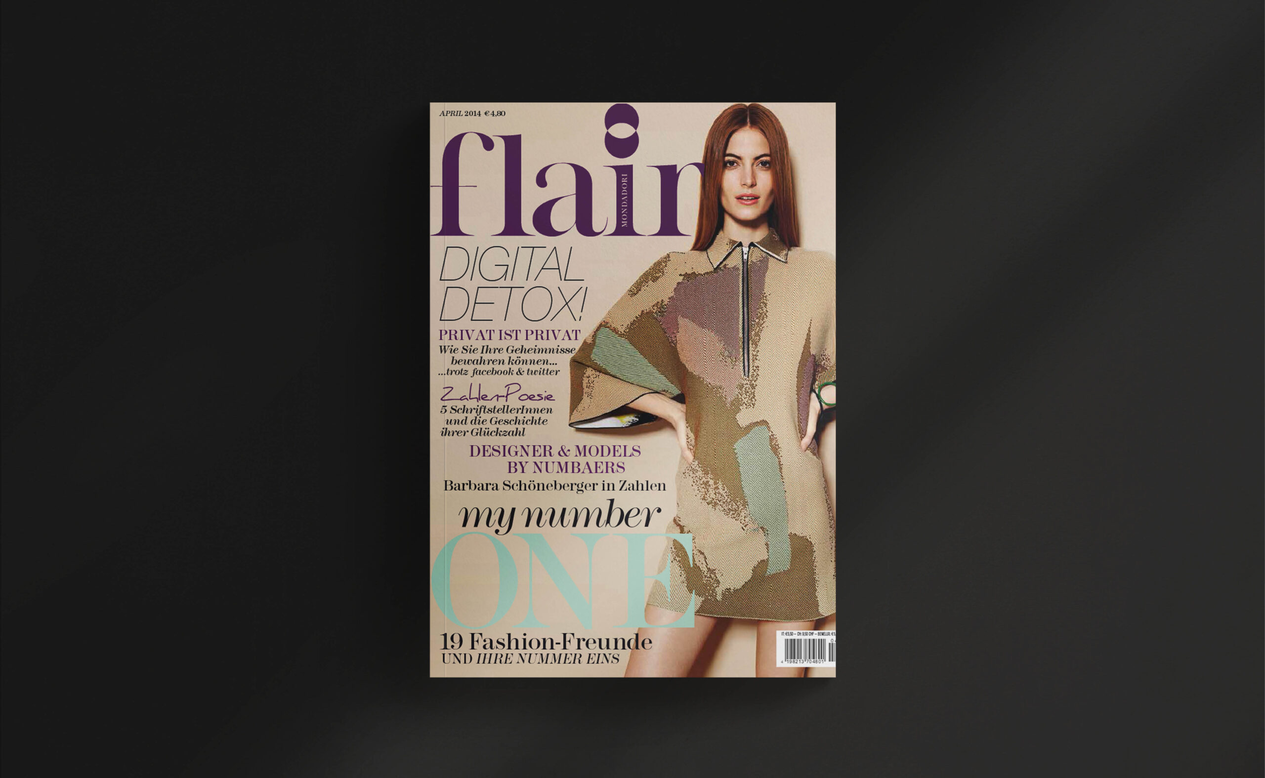
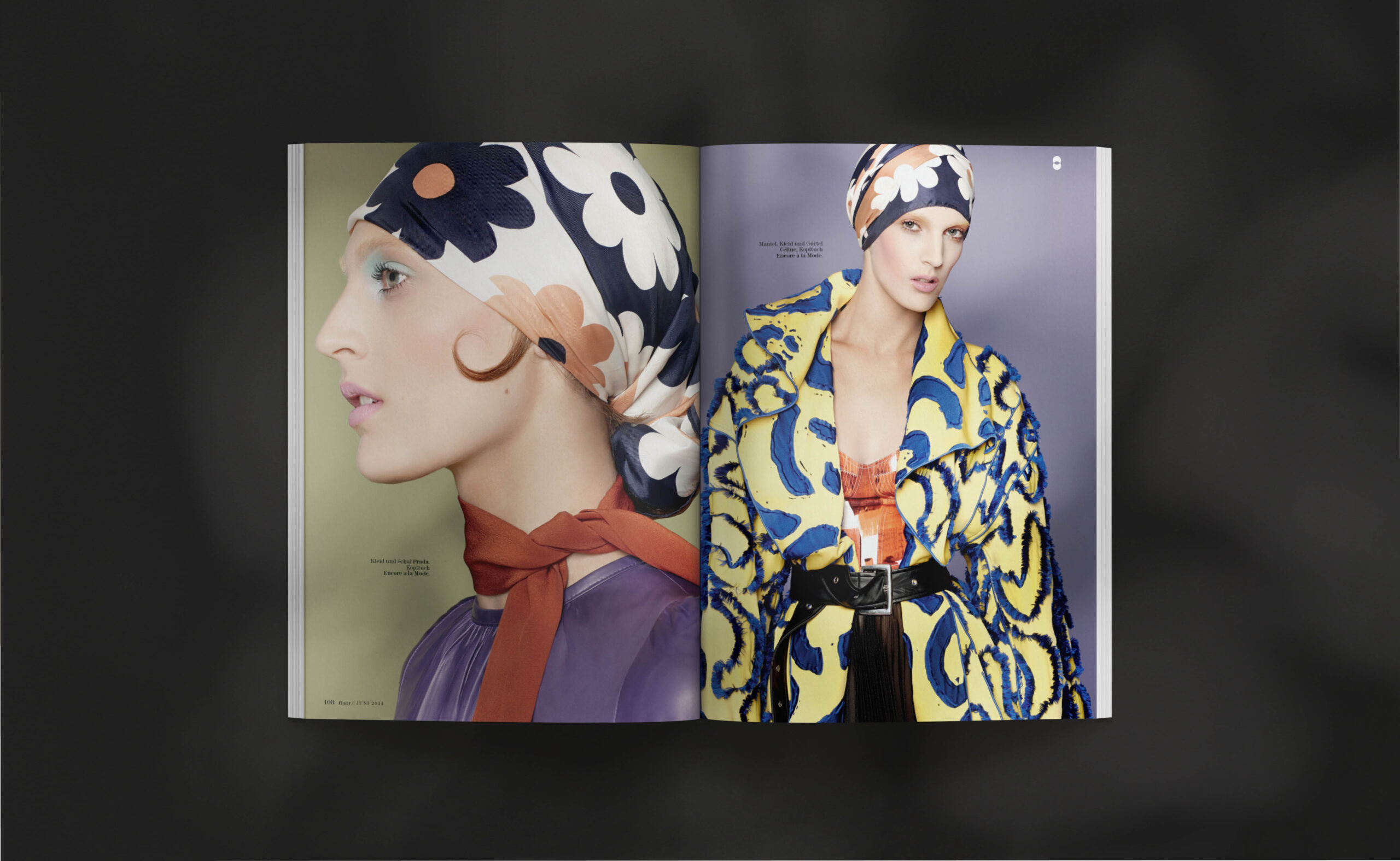
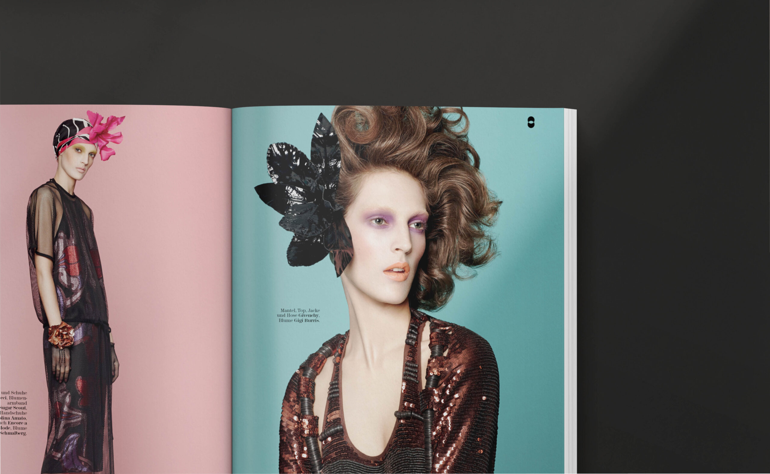
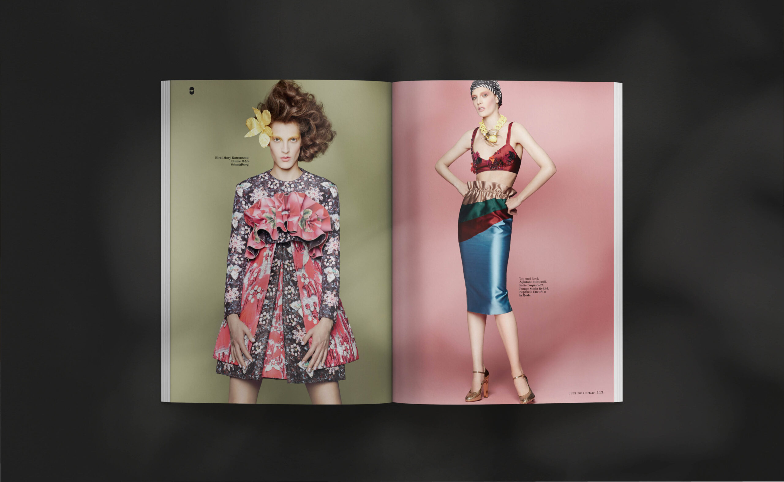
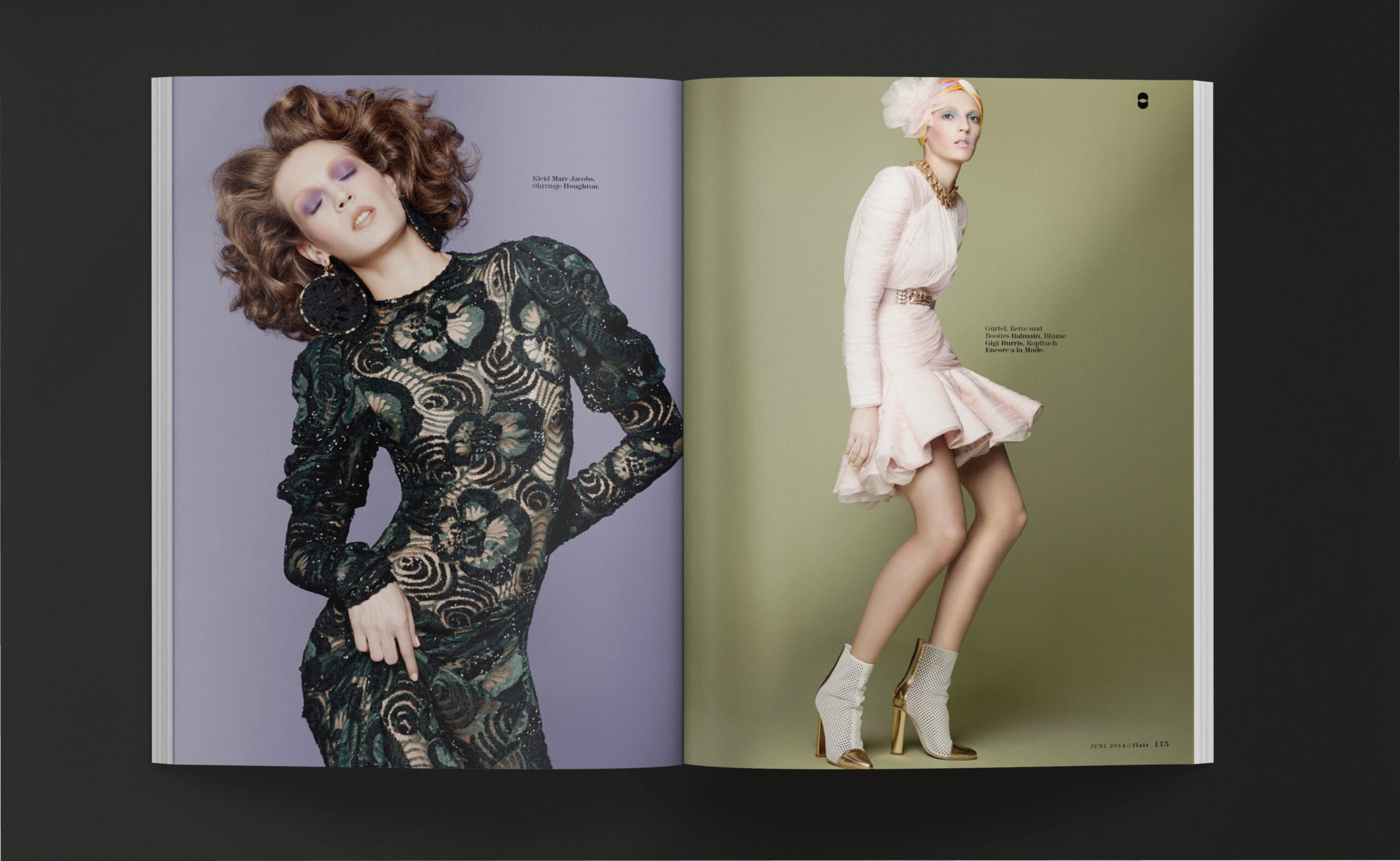
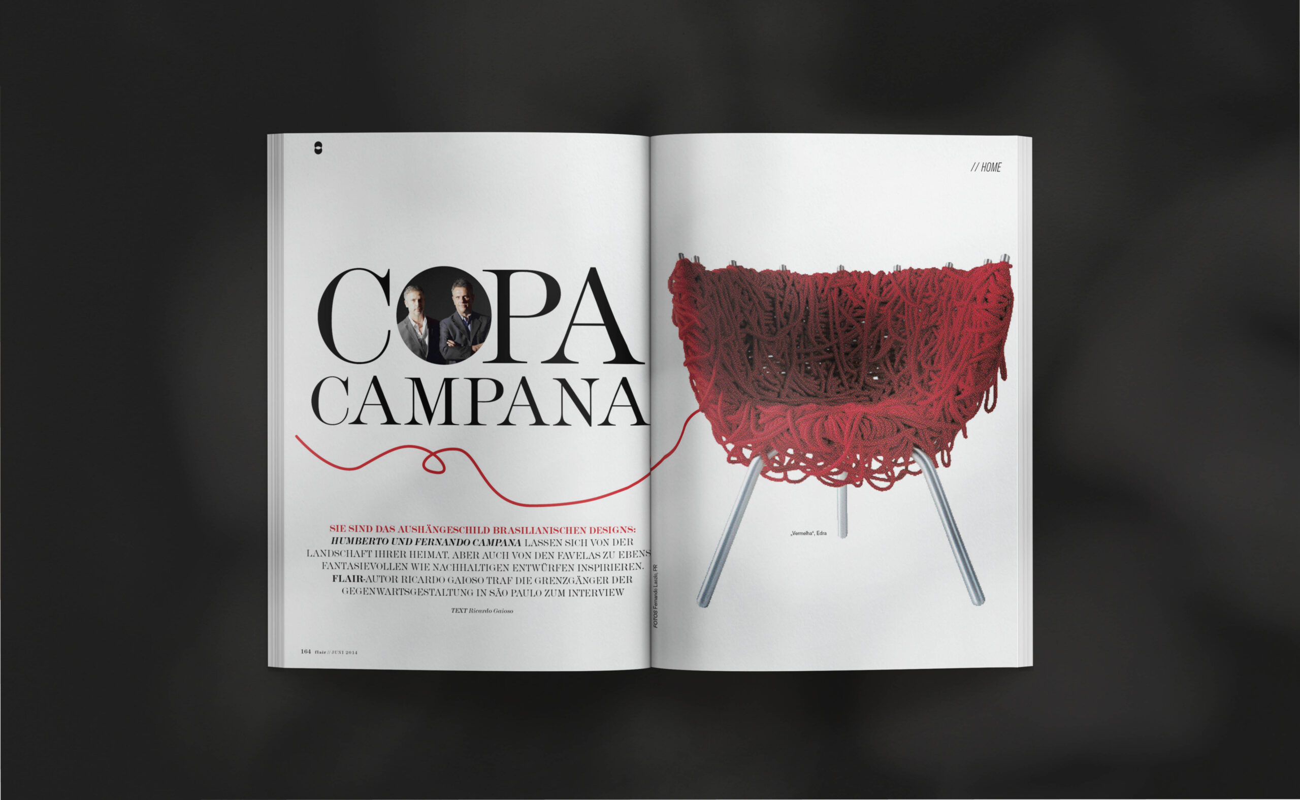
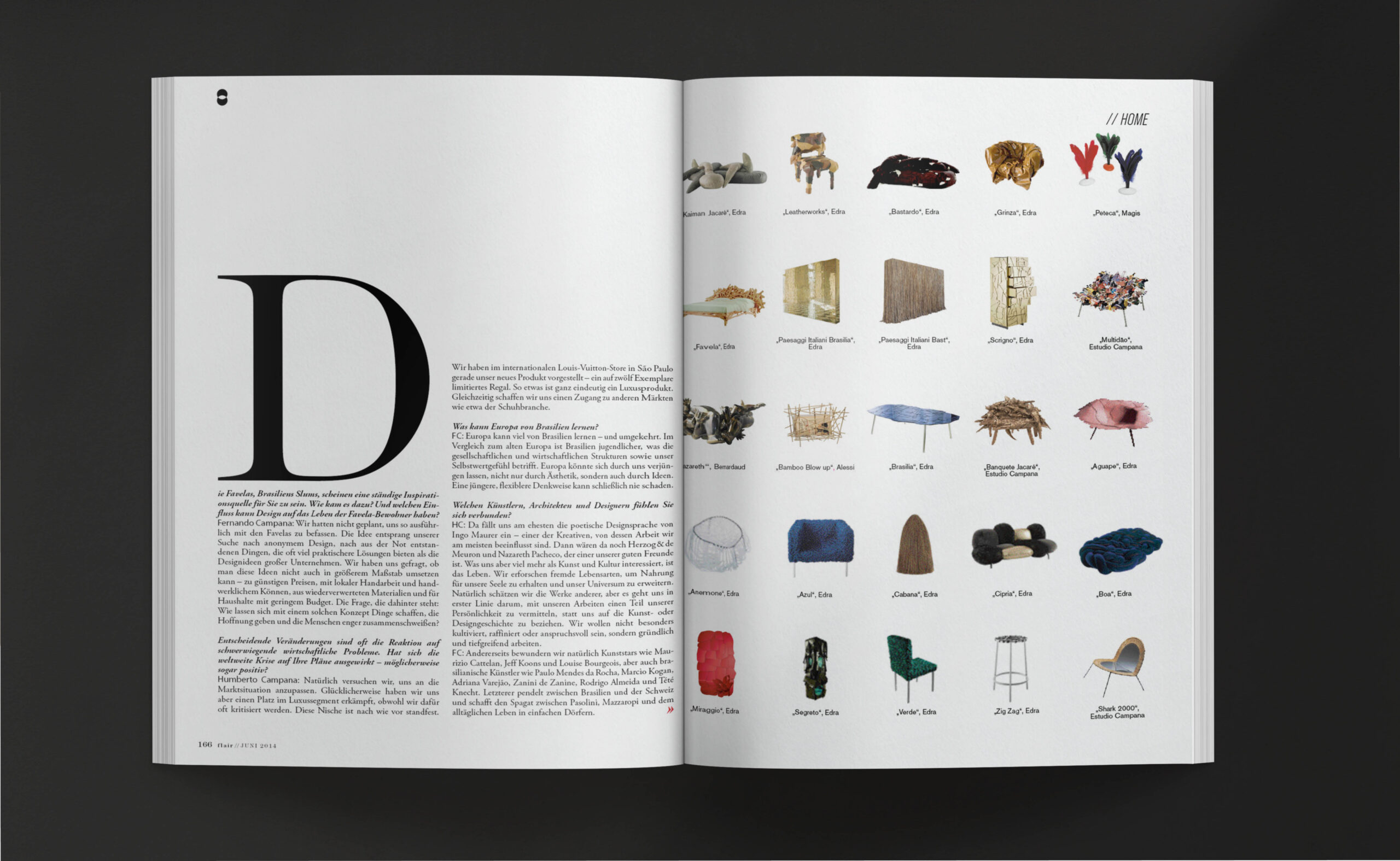
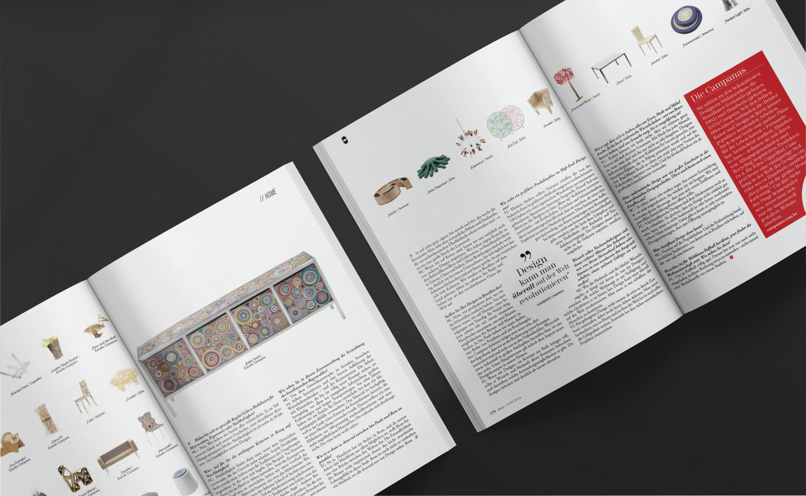
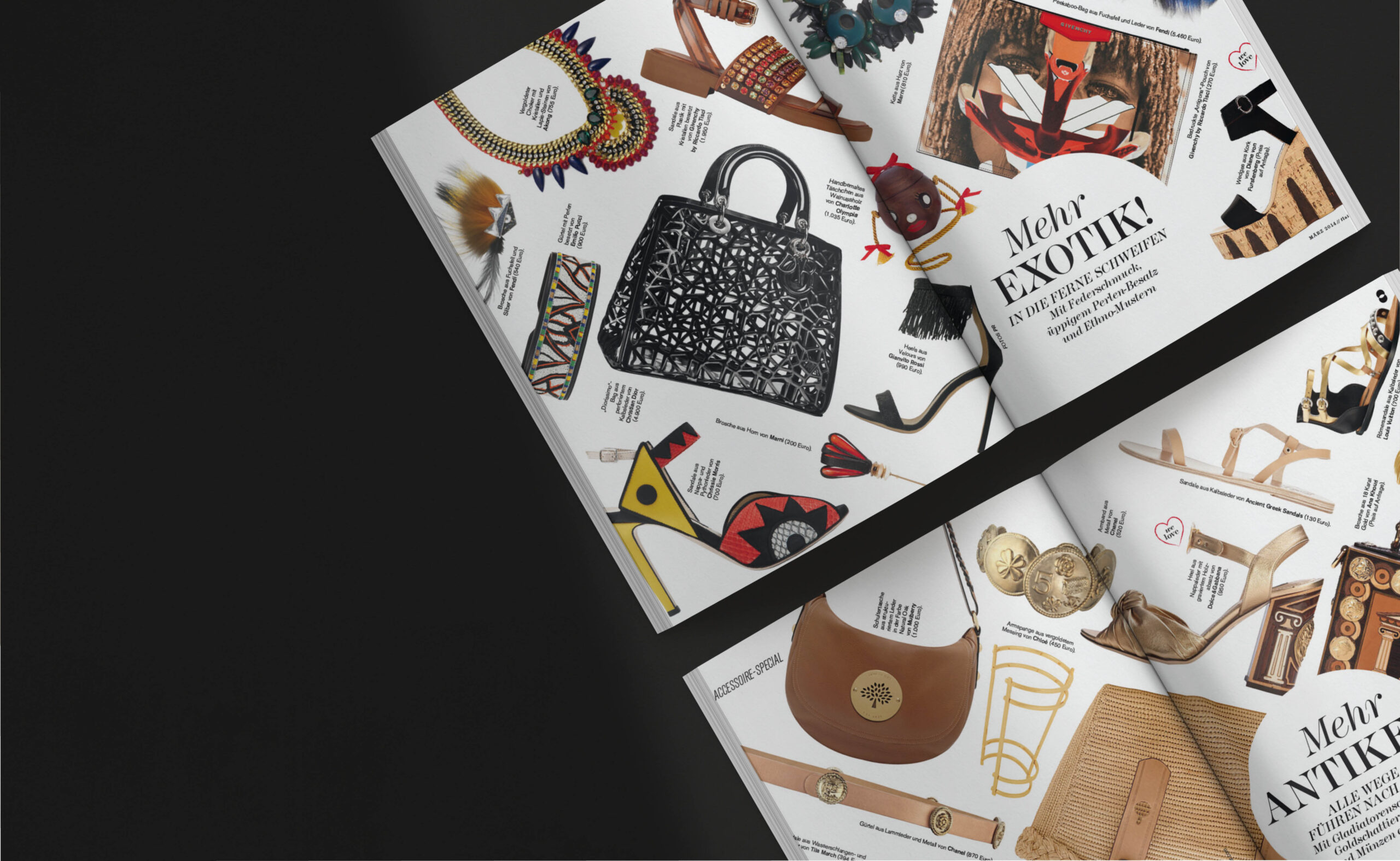
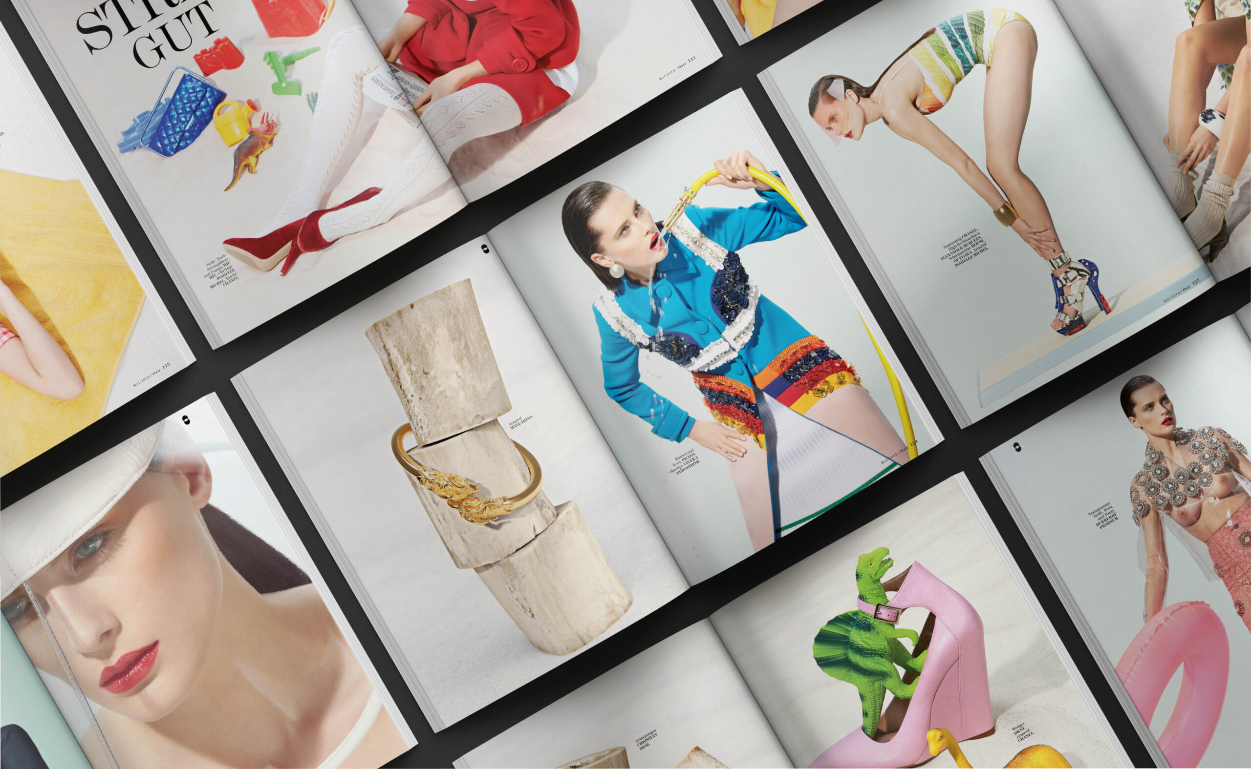
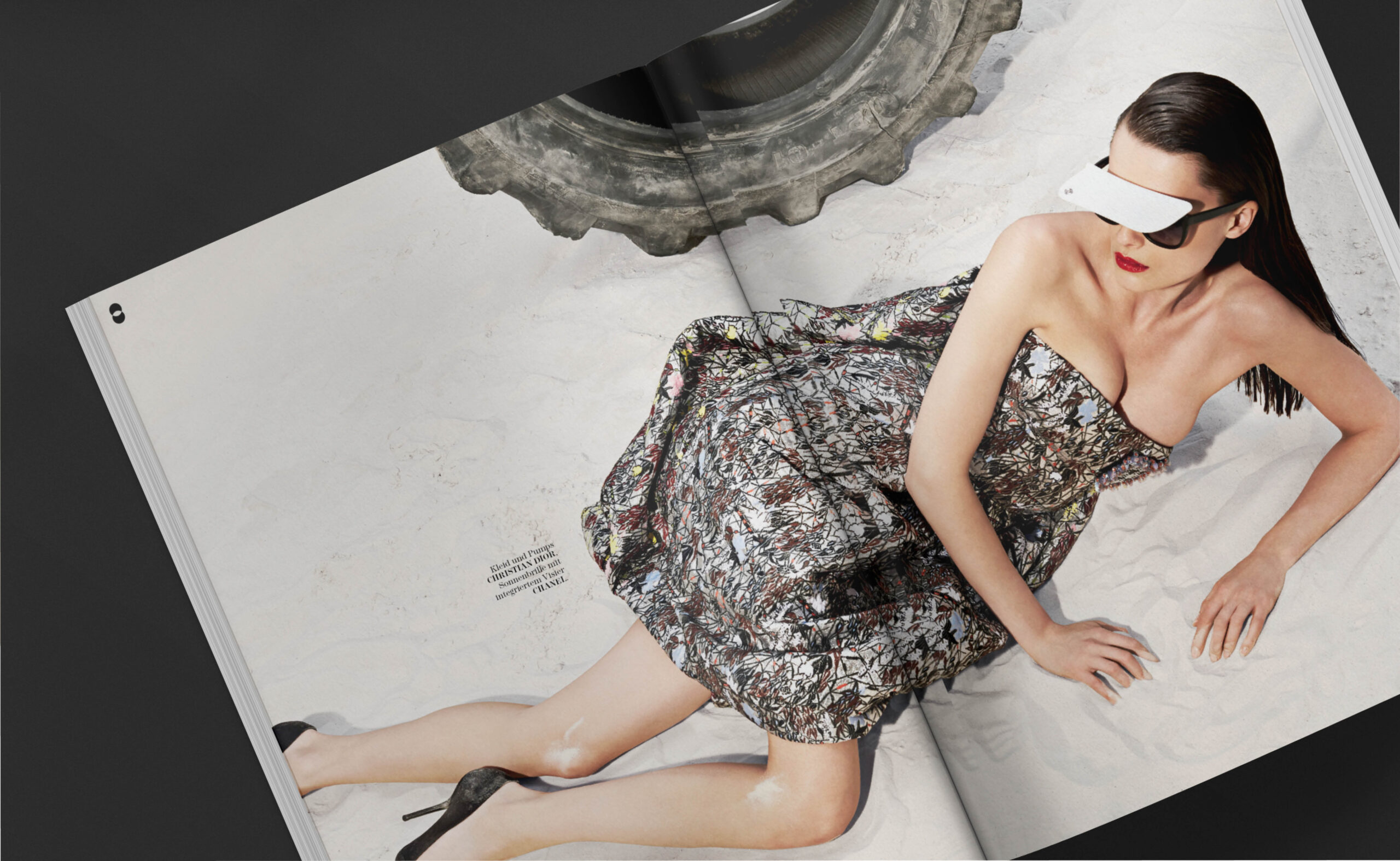
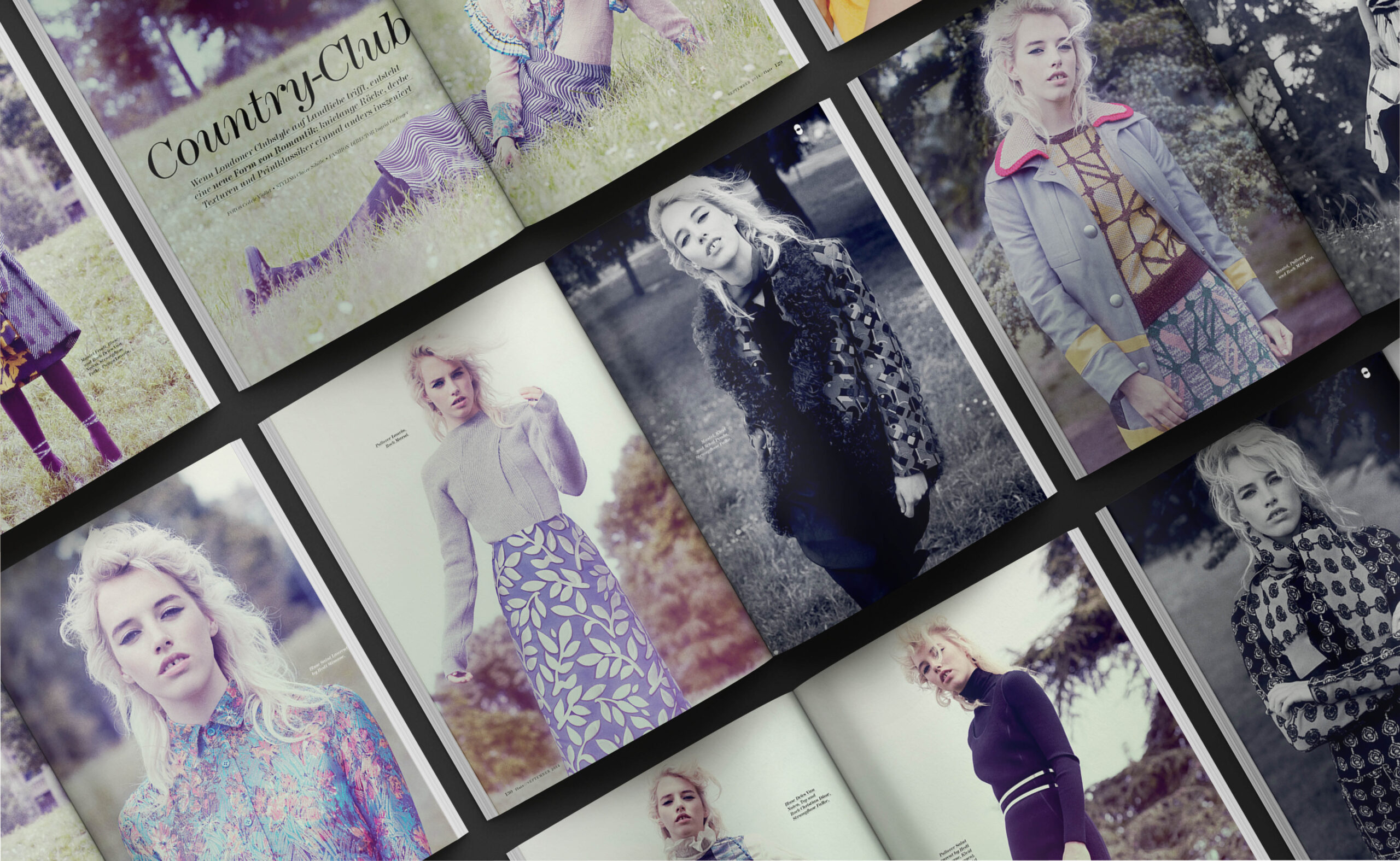
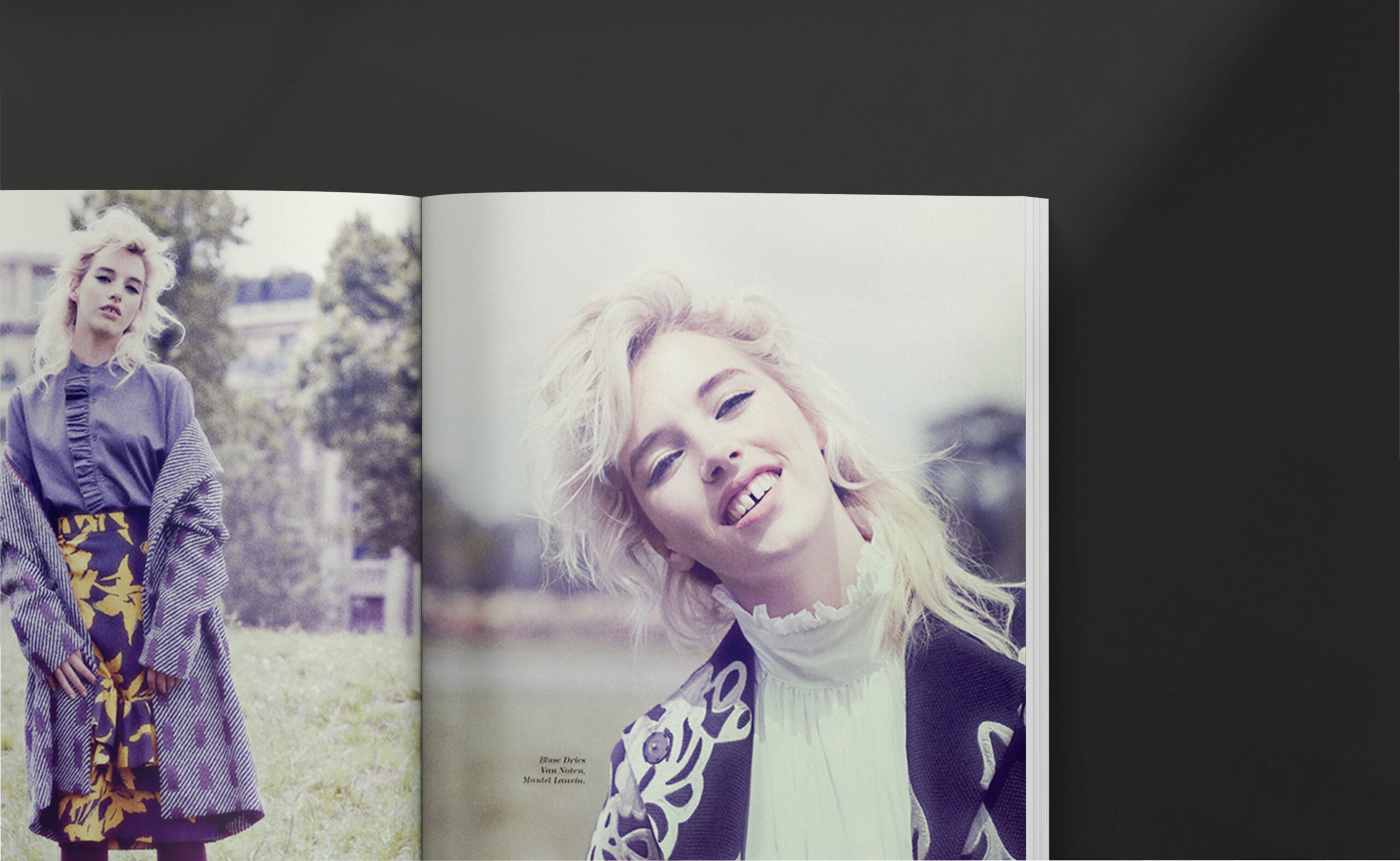
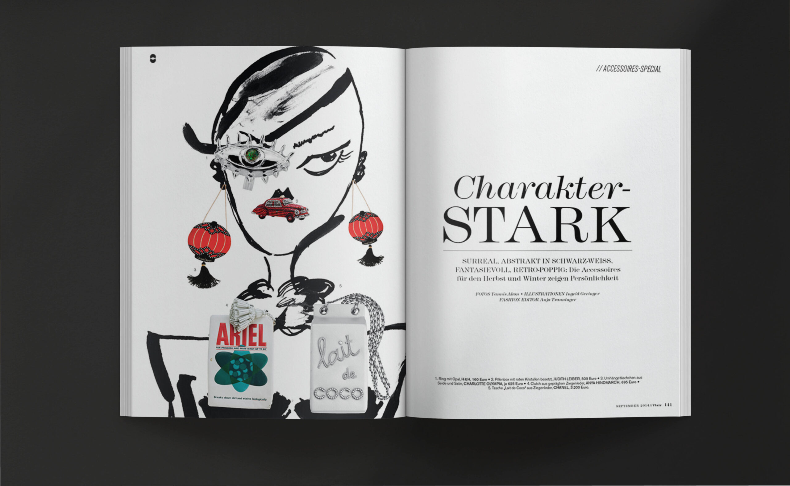
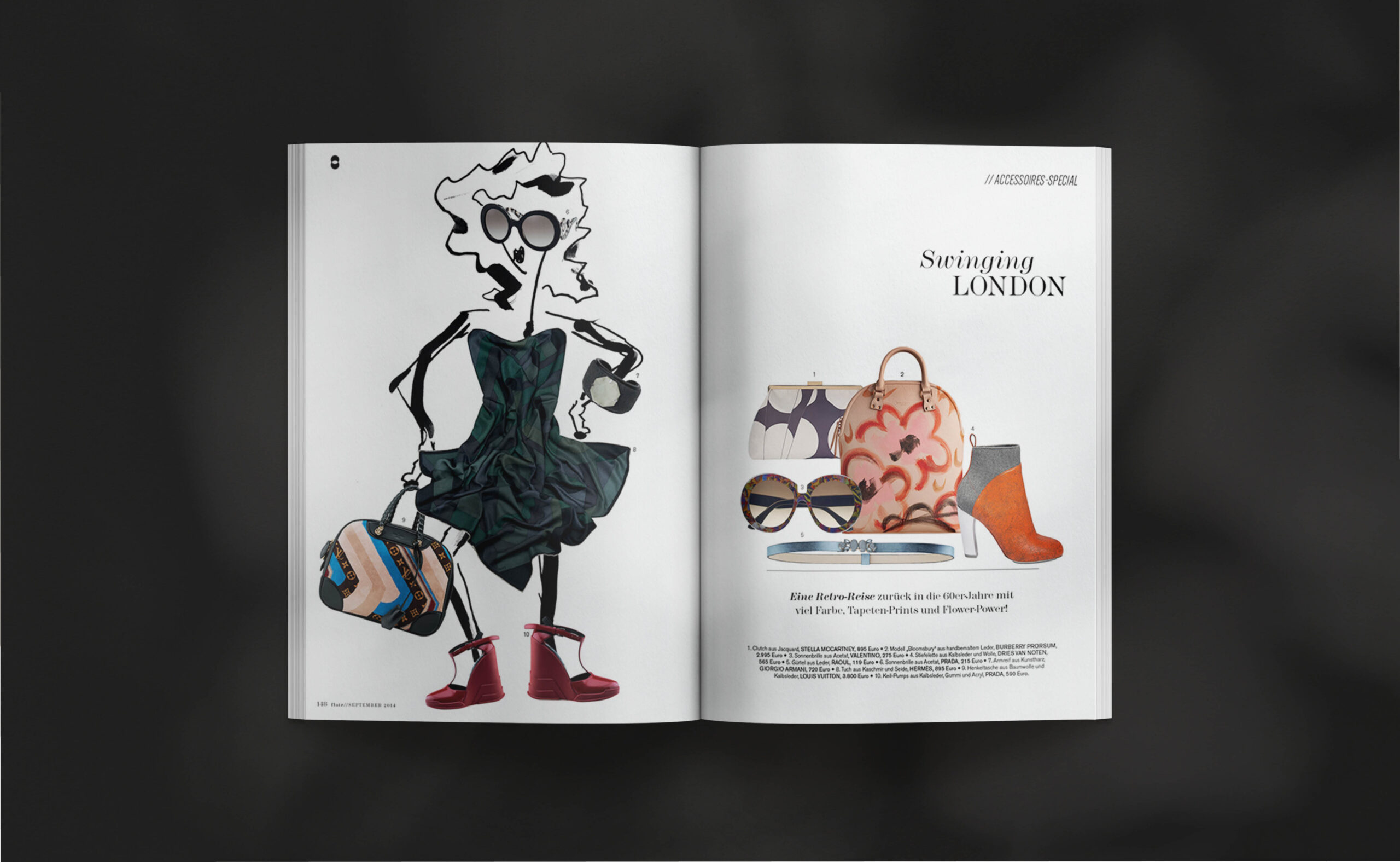
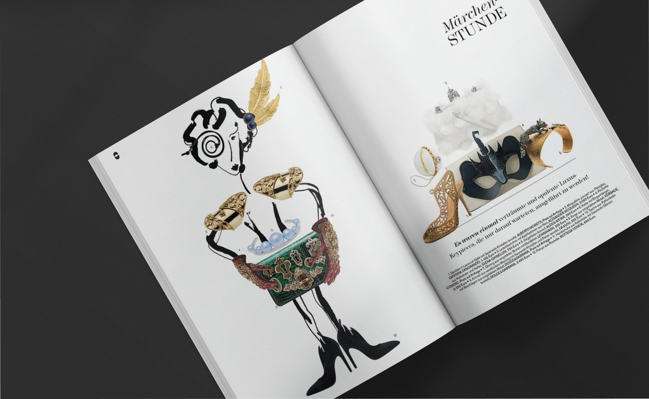
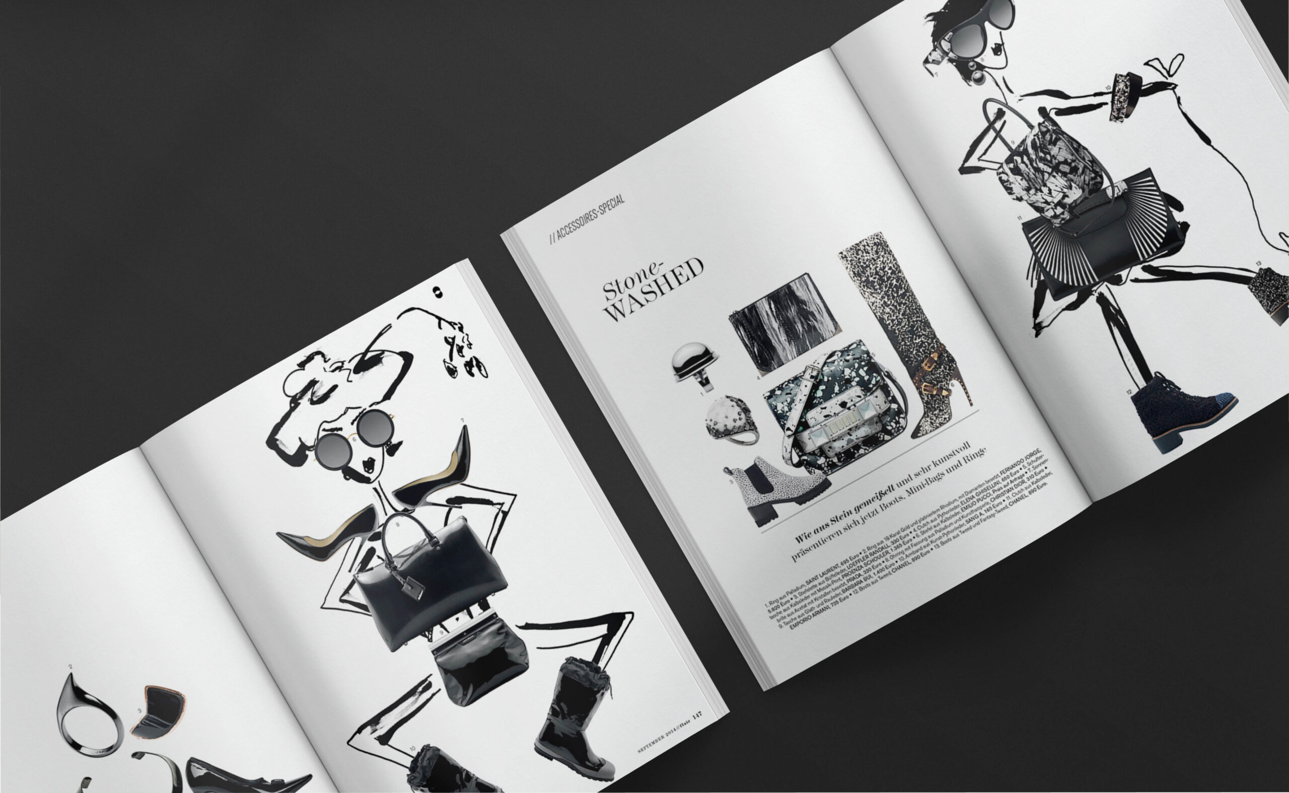
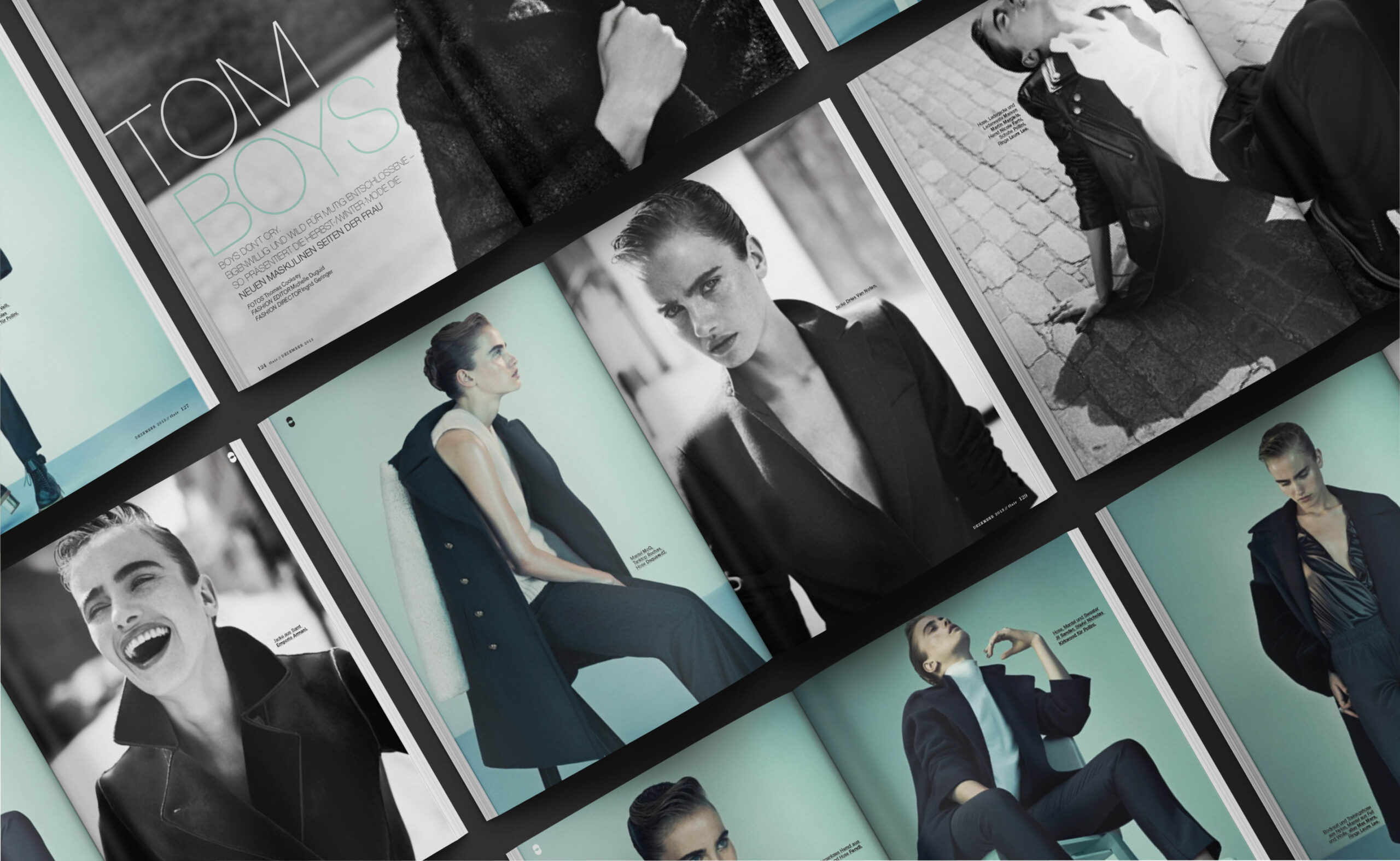
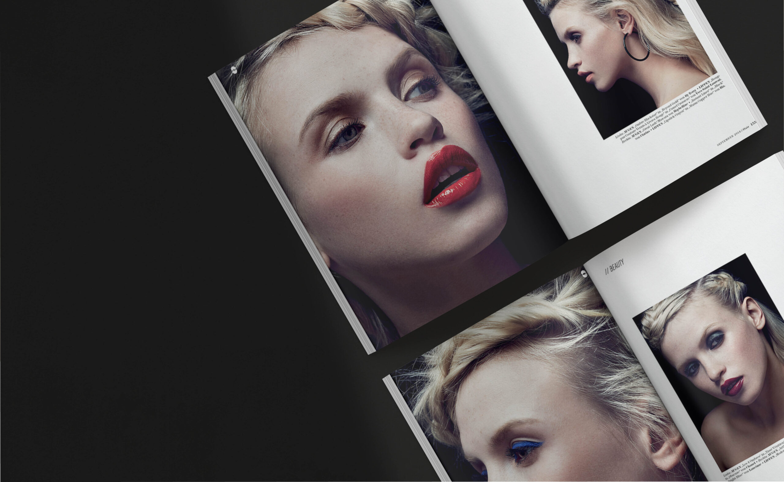
FLAIR is a monthly women’s magazine published in Germany and Austria under license from Mondadori, Milan. It occupies the premium tier of European fashion and lifestyle journalism — high-end photo productions, extravagant styling, editorial depth across fashion, beauty, culture, and contemporary life. Between 2013 and 2015, the magazine underwent a comprehensive repositioning: a new publishing license, a new market structure, a new editorial identity. The design had to move first.
THE SITUATION
A license acquisition is a particular kind of creative problem. The brand arrives with an existing international identity — established visual codes, a reader expectation, a market position — and a mandate for local relevance that, handled carelessly, produces something that belongs fully to neither world.
When Ahead Media acquired the FLAIR license from Klambt Media, the brief was clear in its ambition and open in its method: transform FLAIR into a mono-thematic monthly publication with localised content for Austrian and German markets, while maintaining the international DNA and premium visual standards of the original Mondadori title.
The design challenge was to hold both requirements simultaneously — not as a compromise between them, but as a genuine synthesis. A magazine that read as unmistakably European and precisely German-speaking. That required building a new visual system, not adapting an existing one.
THE READING
The Mondadori FLAIR carried a specific visual register: generous, fashion-forward, confident with white space, never decorative for its own sake. That register was the inheritance. The question was how to localise it without diluting it — to make the magazine feel culturally grounded in the DACH market without retreating into the visual conventions of German magazine publishing, which tend toward density and information hierarchy over atmosphere.
The editorial repositioning as a mono-thematic publication was the structural key. Each issue organised around a single theme — rather than the conventional section-by-section structure of monthly magazines — created the conditions for a more sustained visual argument. The design could build across an issue rather than restart with each section.
This was the opportunity. A mono-thematic structure demands a design system that can hold variation within consistency — different content registers, different visual temperatures, but always recognisably the same publication.
THE DECISION
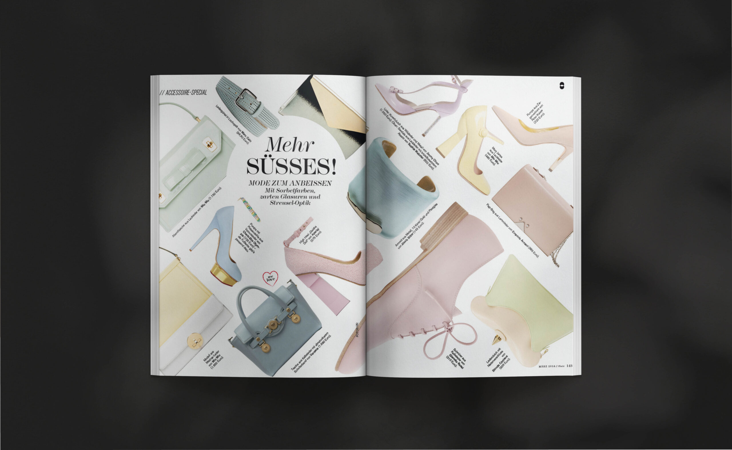
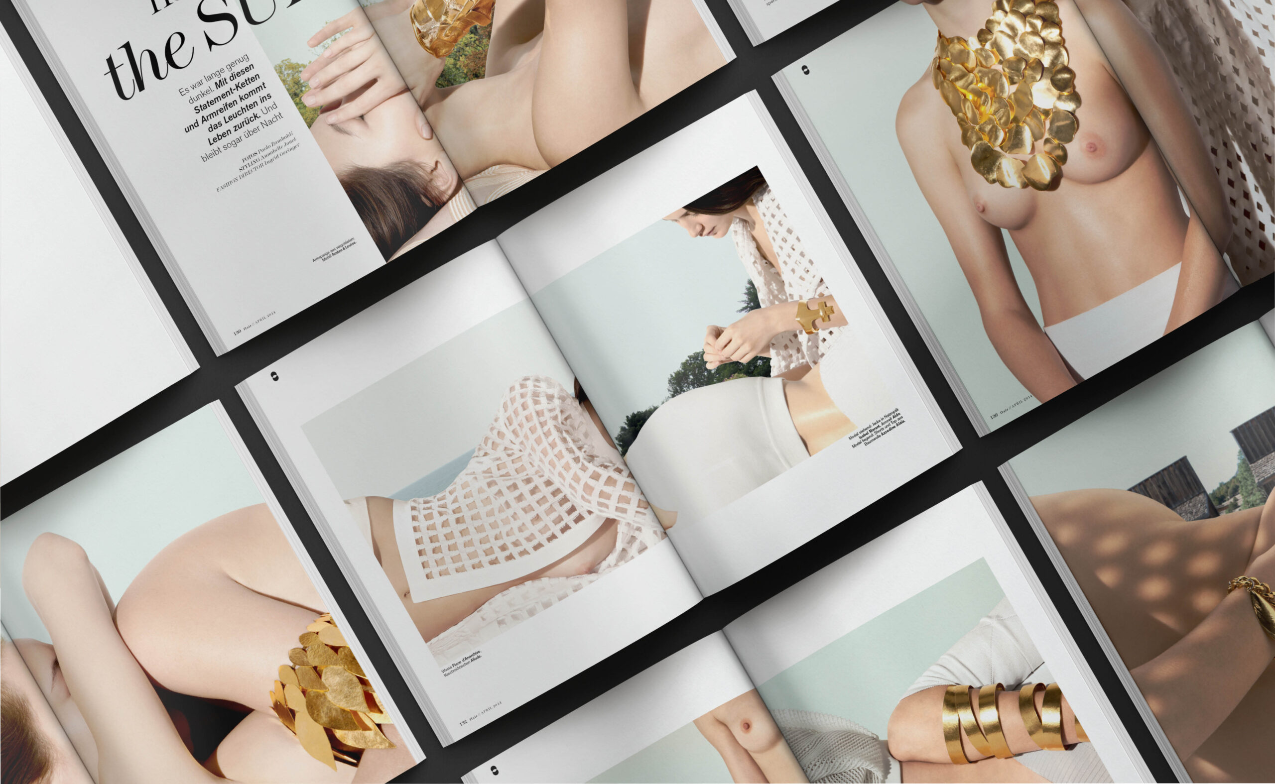
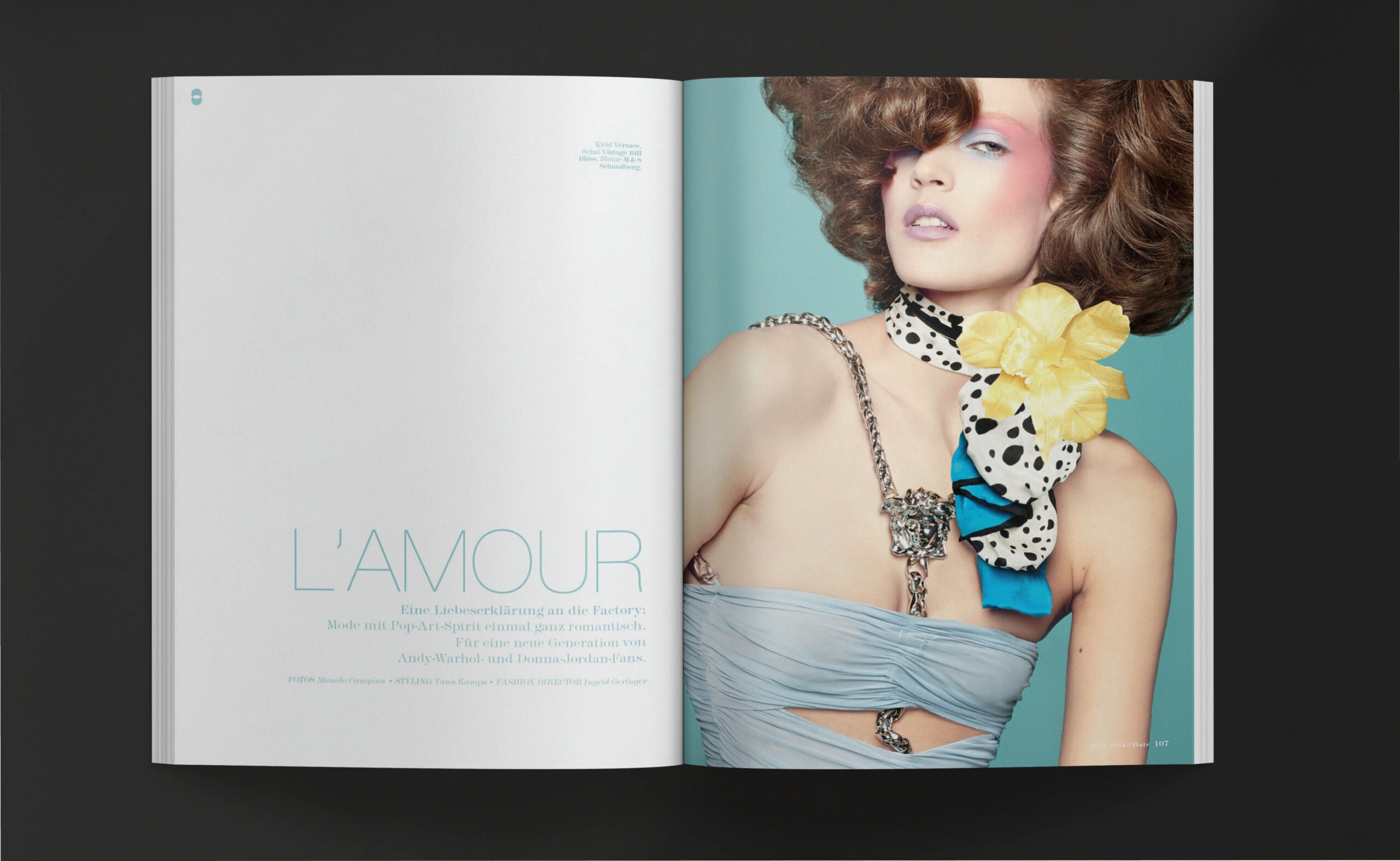
The central decision was systemic: to build a layout architecture flexible enough to carry fashion, home, beauty, lifestyle, and event content within a single coherent visual identity, without those categories collapsing into visual sameness or fragmenting into incoherence.
Typography was the primary structural tool. A typographic system that carries hierarchy, atmosphere, and personality simultaneously — that reads as premium without the self-consciousness that premium magazine design frequently produces. The grid was generous but not loose; it gave the photography room without ceding the page to it.
Team leadership was inseparable from the design work. The Vienna design department operated in close coordination with the Berlin editorial team — different cities, different publishing cultures, one visual outcome. Coordination was not administrative; it was creative. The design decisions made in Vienna had to be legible and reproducible in Berlin, and vice versa.
THE WORK
Art direction and visual concept for FLAIR Germany and Austria. Layout system and magazine design — average 178 + 4 pages per issue. Design team leadership and editorial production coordination between Vienna and Berlin. Monthly publication covering fashion, home, beauty, lifestyle, and events. Full design responsibility across two years of continuous publication.
THE SHIFT
The repositioned FLAIR established itself as a coherent premium publication within the German-speaking market — maintaining the Mondadori visual authority while developing a local editorial identity that its readership recognised as their own.
Two years of monthly publication is a design endurance test. Consistency across 24 issues, across teams, across editorial directions — without visual fatigue, without the identity blurring — is not a given. It is the result of a system built to last, and a team led to understand why the system matters.
That is what sustained editorial direction looks like when it operates as a discipline, not a series of individual issues.