
About this project
What Wood Remembers
By Nature & Knopp is the practice of Stefan Knopp — a furniture maker and object designer based in Salzburg whose work is built on a single, deeply material conviction: that wood carries a character formed over decades, and that the designer’s role is not to impose form upon it but to honour what is already there. When the collaboration began in 2022, the entry point was a price list. What was needed was a language equal to the objects.
THE SITUATION
A price list is the most reductive document a maker produces. It names the object, states the dimension, gives the number. It is entirely legible and entirely wrong — because it communicates nothing about why the object exists, what decisions produced it, or what kind of attention it demands from the person who lives with it. For most manufacturers, this gap does not matter. The product sells through specification. The catalogue supplements the showroom.
For Stefan Knopp, the gap was the whole problem. His work is not specified into existence. It emerges from a physical, sustained engagement with individual pieces of wood — from reading the grain, the surface, the particular light a tree’s life has left behind. Each object is the result of decisions that cannot be reduced to a material designation and a price. But the only document the brand had for communicating its work treated it as though they could.
The immediate brief was to redesign a price list. The actual task was to build a brand language from the ground up — one that could carry the material intelligence of the maker into every touchpoint, from catalogue to website to the moment a sales partner introduces the work to a client who has never held a piece of Knopp furniture in their hands.
THE READING
The central difficulty in communicating craft at this level is not that the work is too complex to describe. It is that the conventional language of premium craft — warmth, authenticity, handmade, natural — has been worn smooth by overuse. It gestures toward the right values and conveys nothing. Every maker who has ever worked with wood uses the same vocabulary. The words no longer make distinctions.
Stefan Knopp’s practice makes a very specific distinction. It is not about naturalness in general — it is about the particular. Each piece of wood is irreproducible. Its surface treatment does not apply a uniform finish; it responds to what the wood already is. The deep, physical engagement with material that shapes every design decision is not a process philosophy. It is an argument about what objects are for — that the most enduring ones carry evidence of their own formation, that living with them means living with something that has a longer history than the room it occupies.
This distinction — between generic craft warmth and specific material intelligence — was the brand’s central asset and its underdeveloped one.
THE DECISION
aesthetic: to treat the catalogue not as a product document with editorial elements, but as an editorial document with product information. The sequence reverses the priority. In a conventional catalogue, the object is primary and the story is supplementary context. Here, the story of each object — the tree, the surface, the decision — is the primary content. The specification follows, because it must. But it follows rather than leads.
This decision had immediate consequences for copywriting, layout, and image direction. Text was written not to describe the furniture but to make legible the thinking that produced it — to put the reader in proximity to the same material attention that Stefan Knopp brings to each piece. Image sequencing followed the logic of the maker’s process rather than the logic of the showroom: detail before overview, surface before silhouette, the particular before the general.
The website, the marketing materials, and the social presence were then built on the same foundation — not as separate channels requiring separate strategies, but as extensions of a single editorial logic. When the language is right, it scales. When it is wrong, no amount of adaptation recovers it.
THE WORK
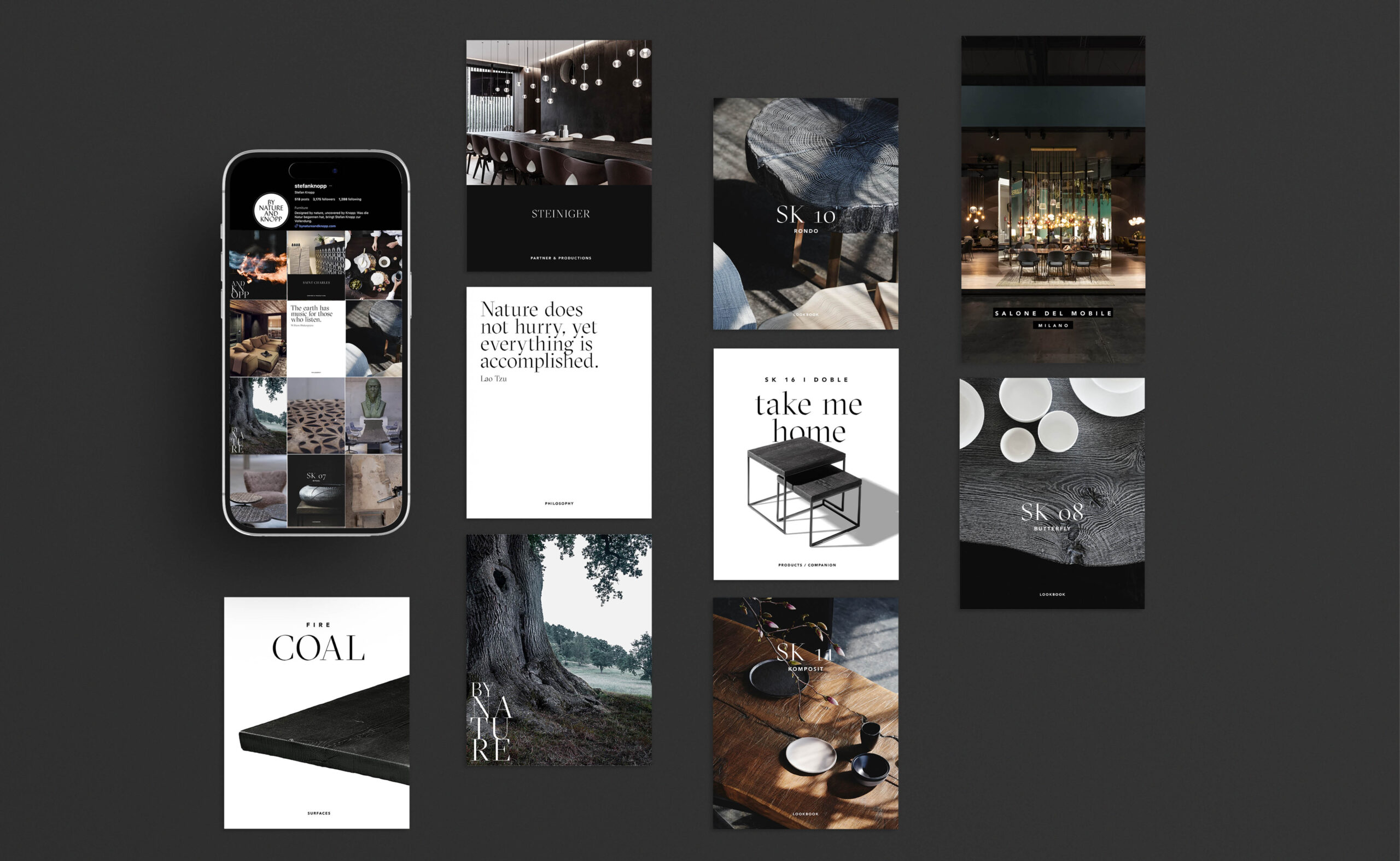
What began as a price list became a brand. The immediate task — redesigning a product document — opened into something larger: a complete editorial and identity system built from the ground up, in sustained collaboration with the maker.
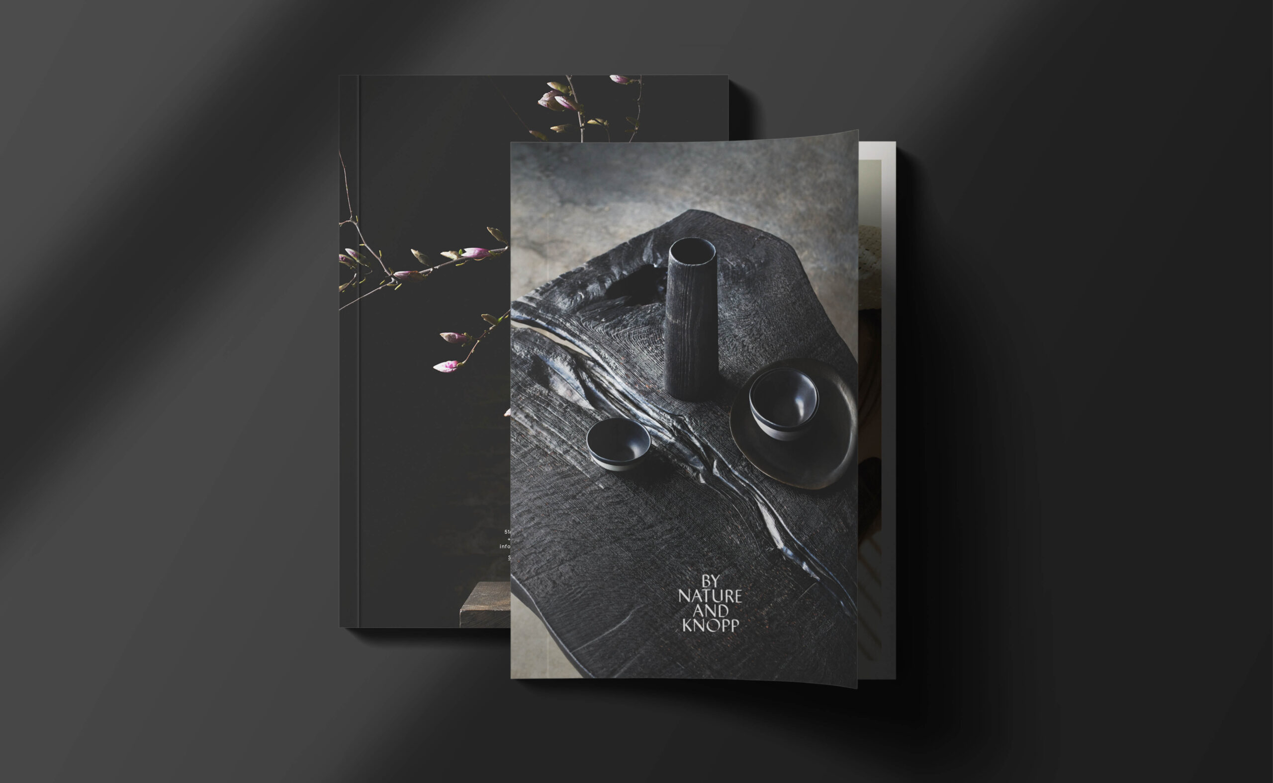
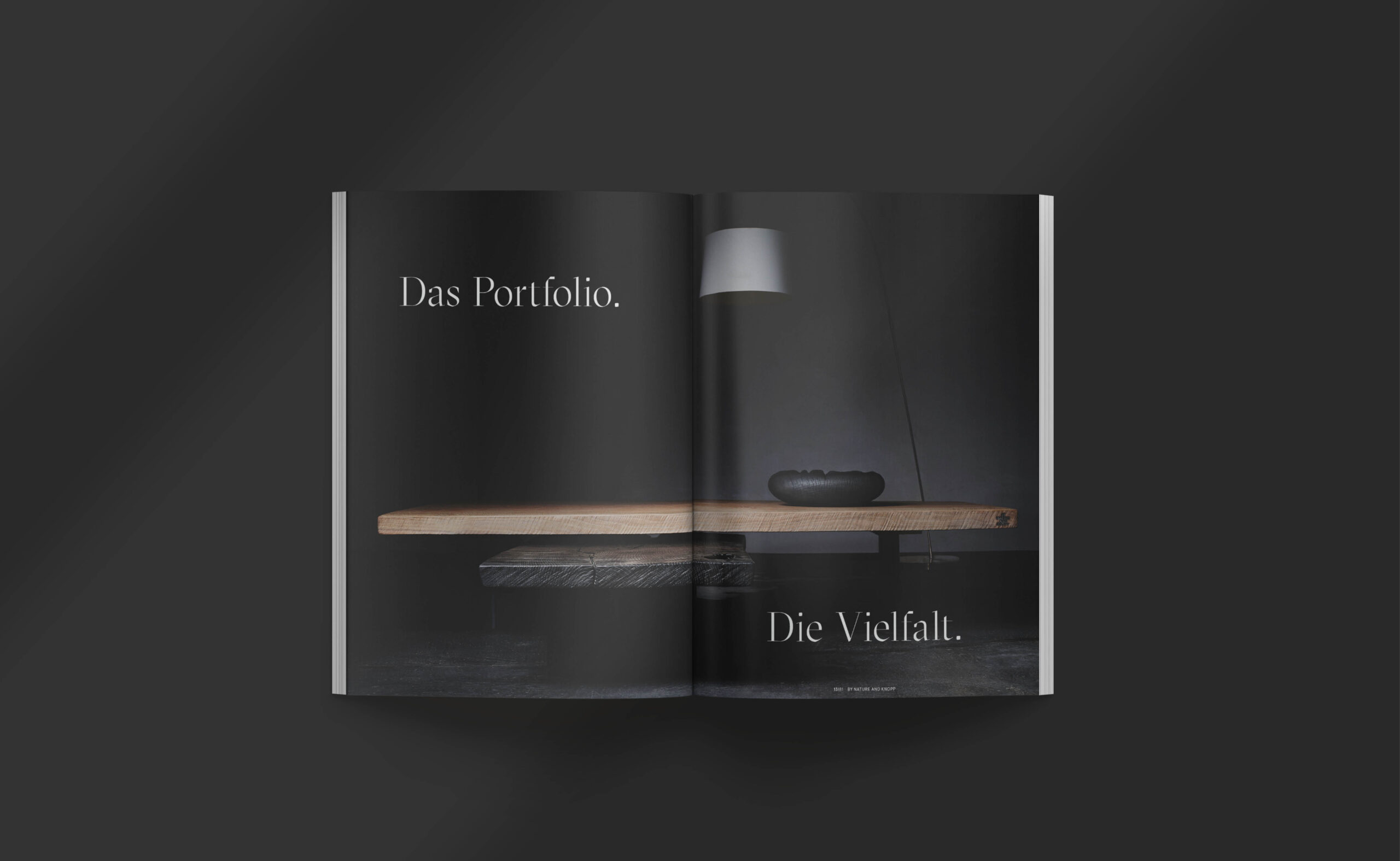
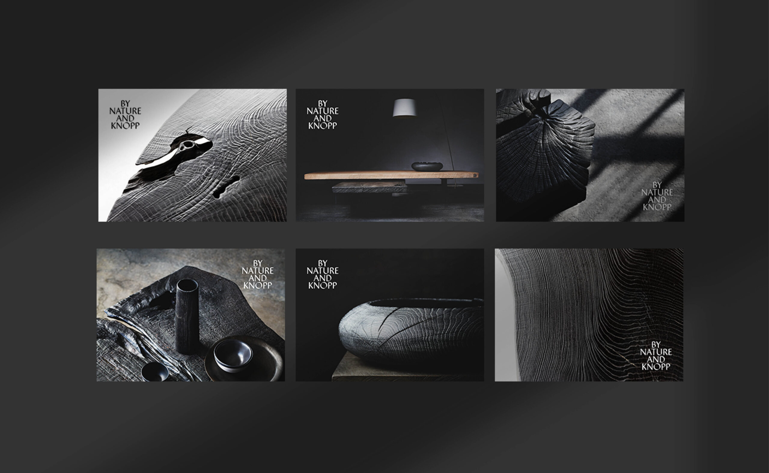
The catalogue first: 84 pages in which the story of each object — the tree, the surface, the decision — carries more weight than its specification. Text written not to describe but to make legible. Image sequencing that follows the maker’s logic: detail before overview, surface before silhouette, the particular before the general. Photography by Andi Waldschuetz, Michael Königshofer, and Gabriel Büchelmeier.
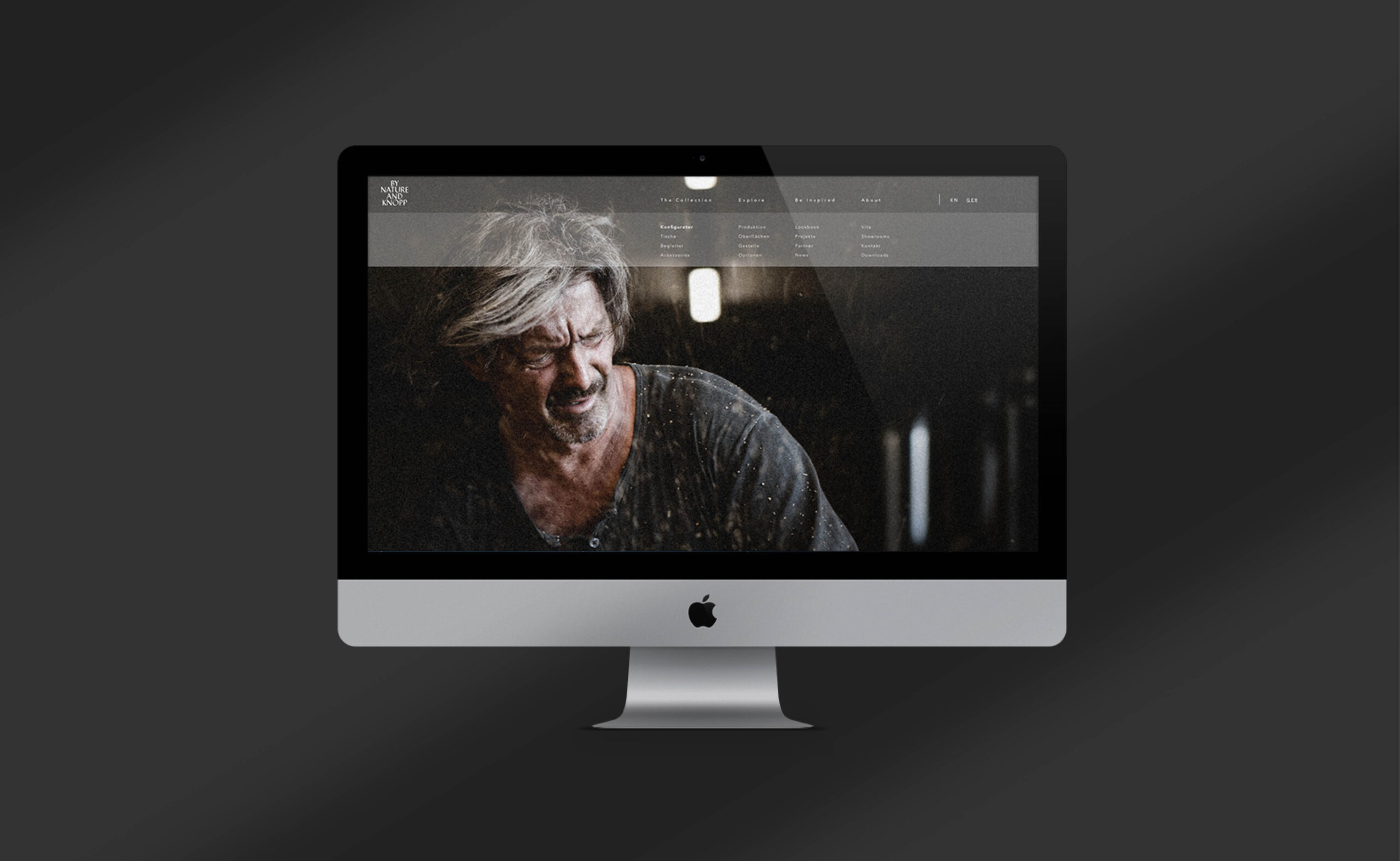
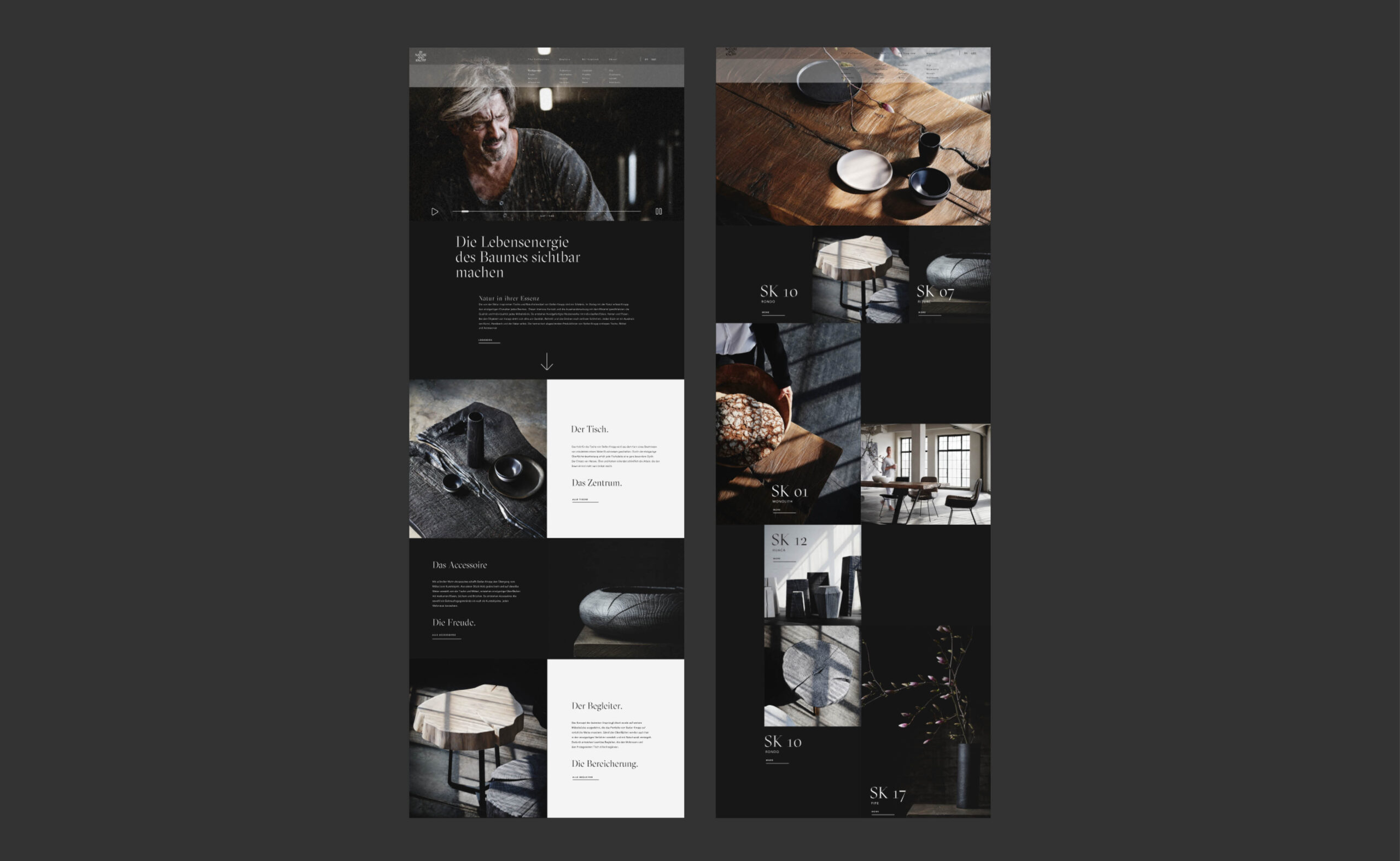
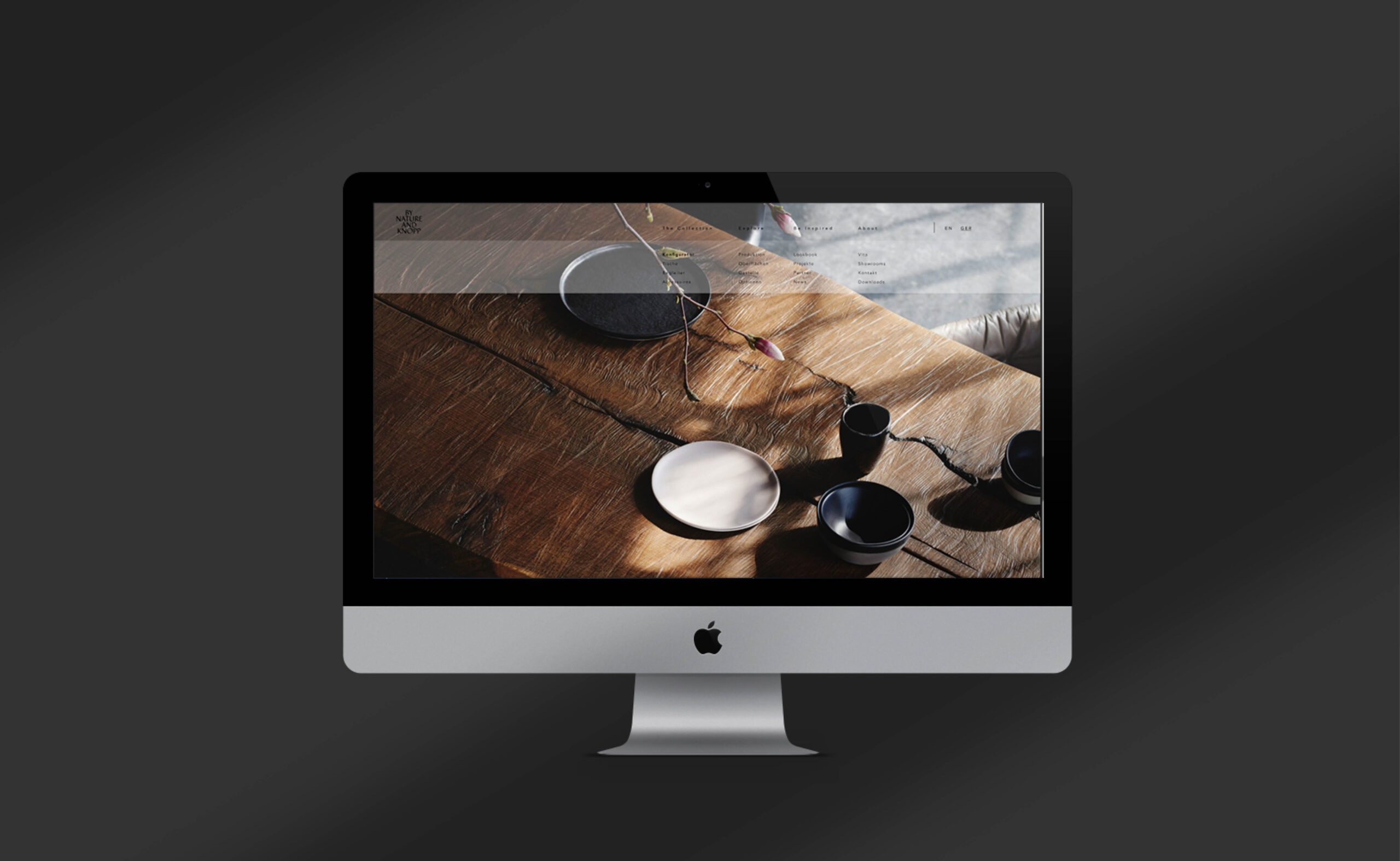
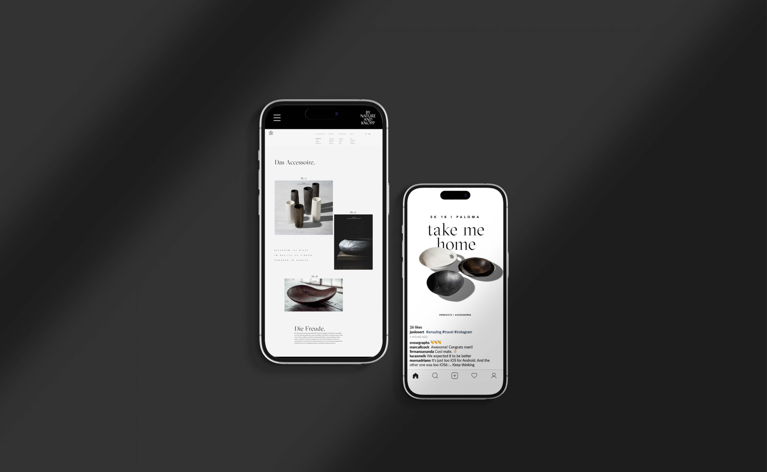
Website design and UX architecture built on the same editorial foundation. Brand storytelling and full copywriting across all channels. Social media content and strategy. Marketing materials and corporate publishing through to print-ready final artwork.
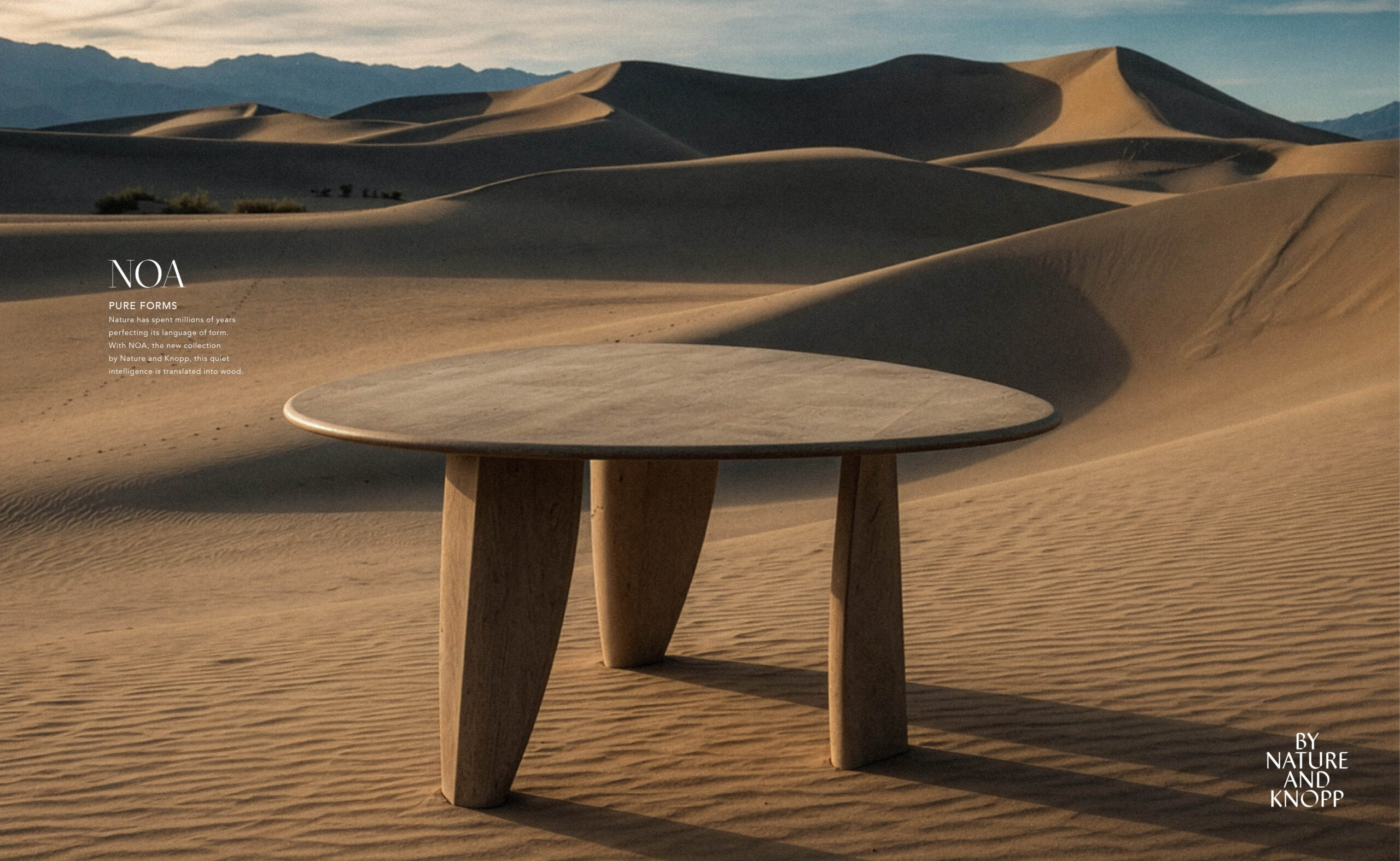
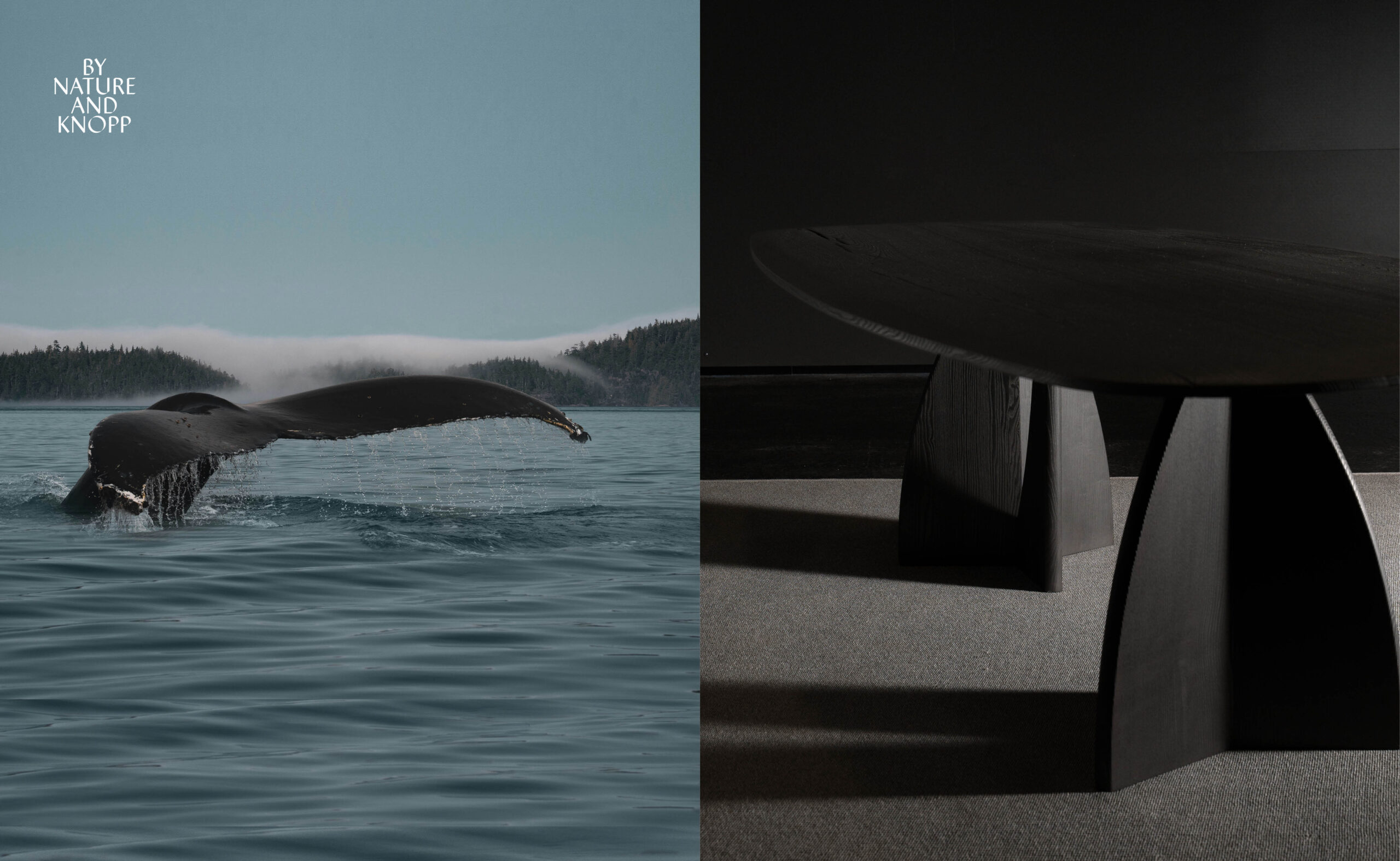
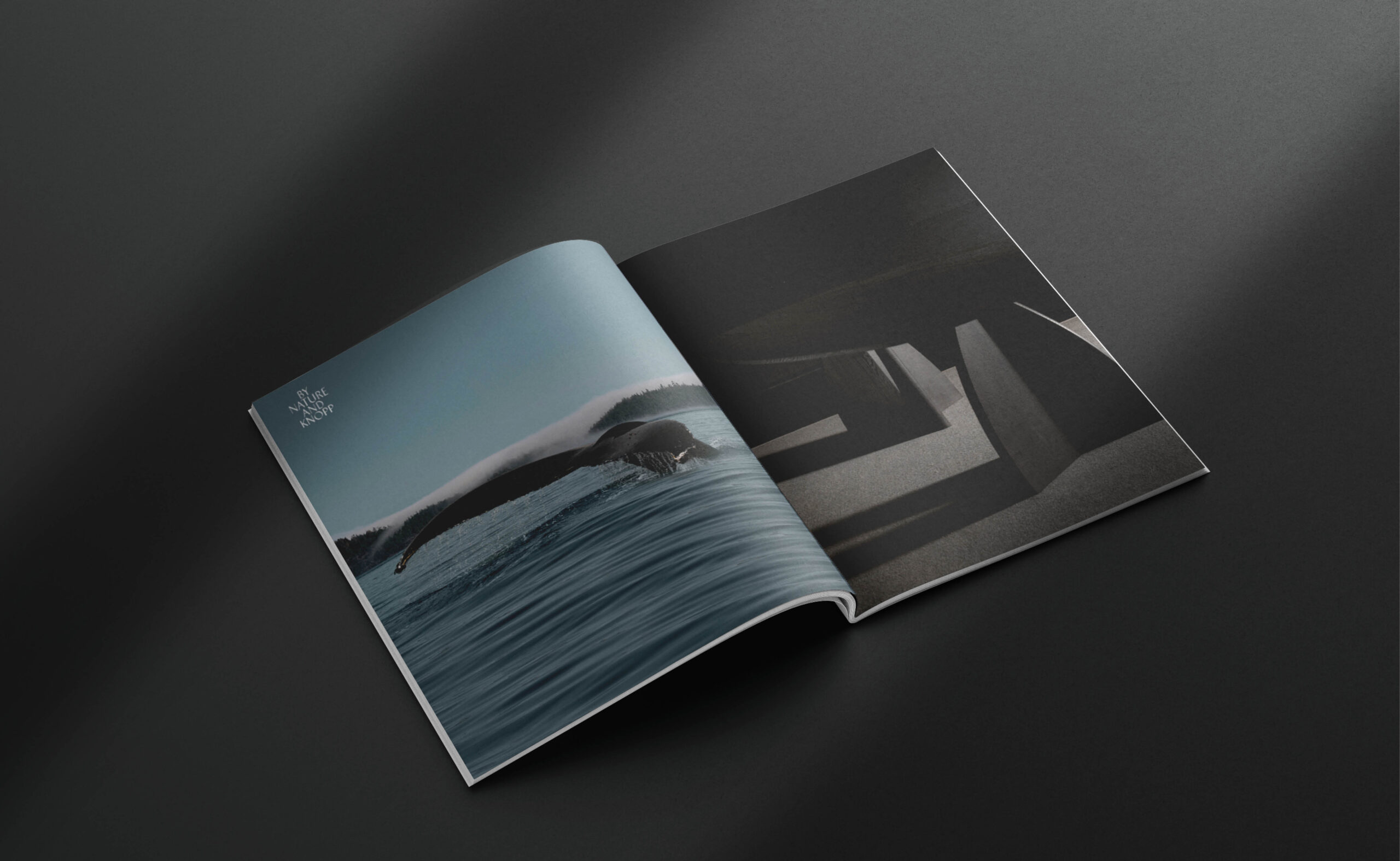
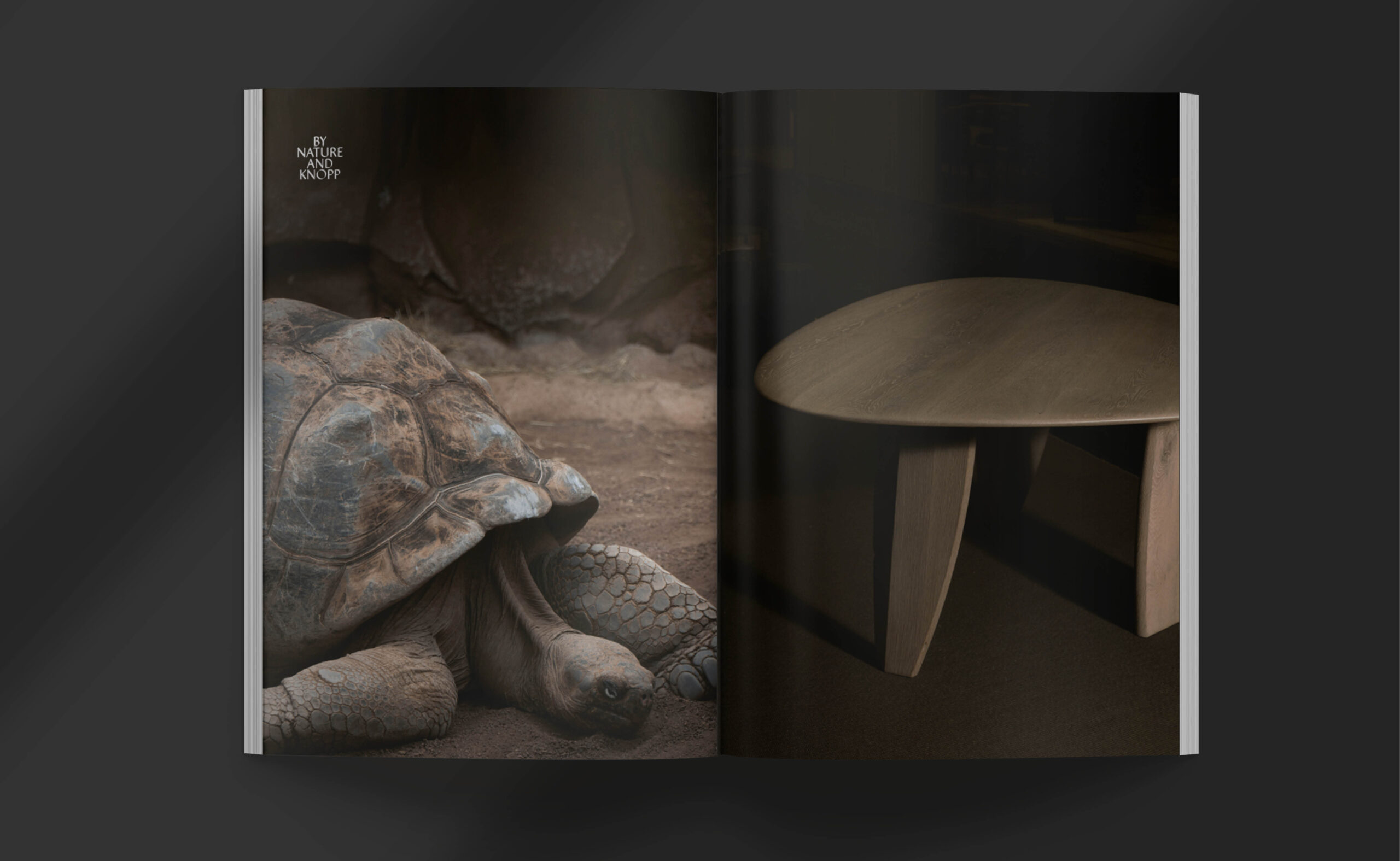
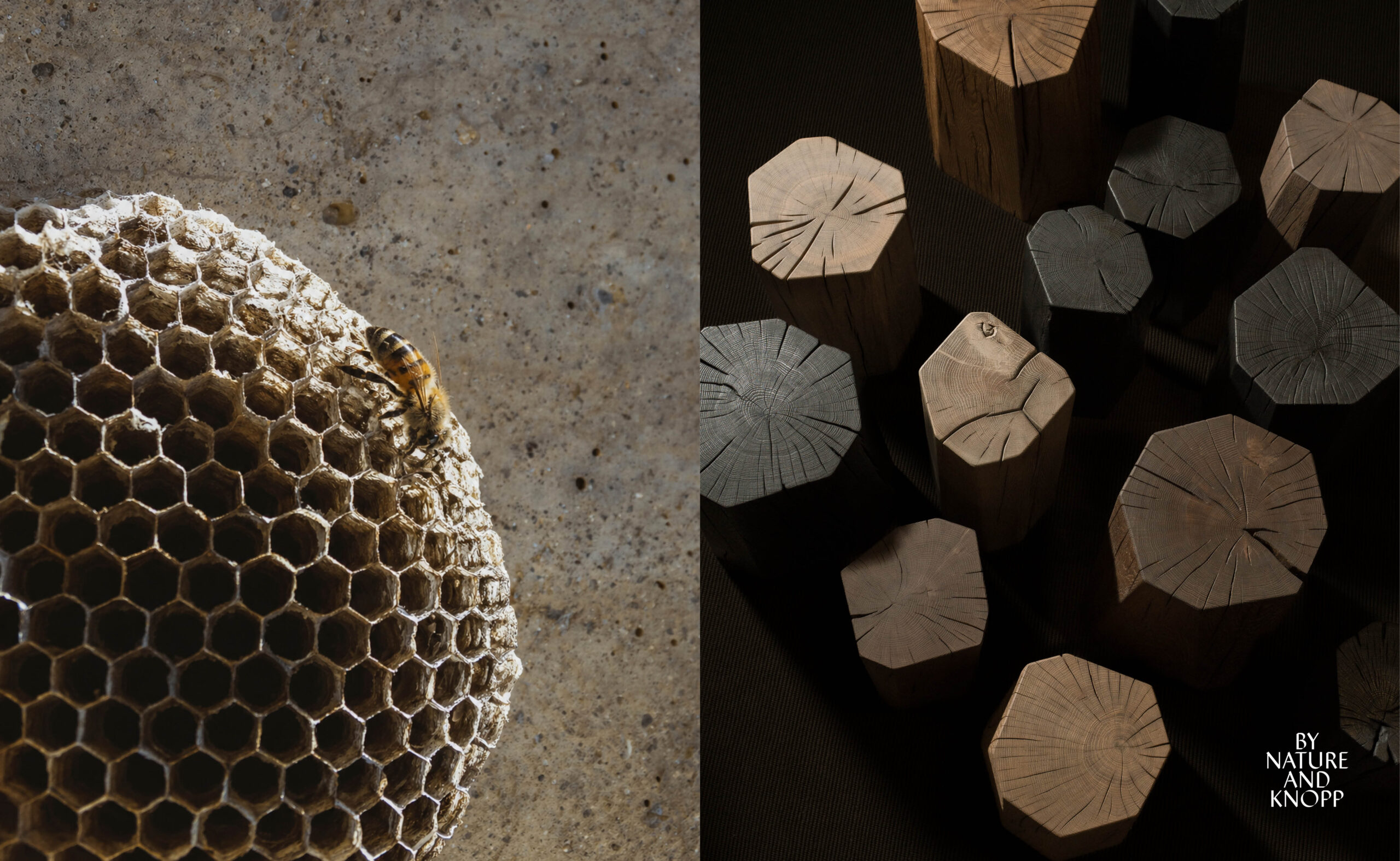
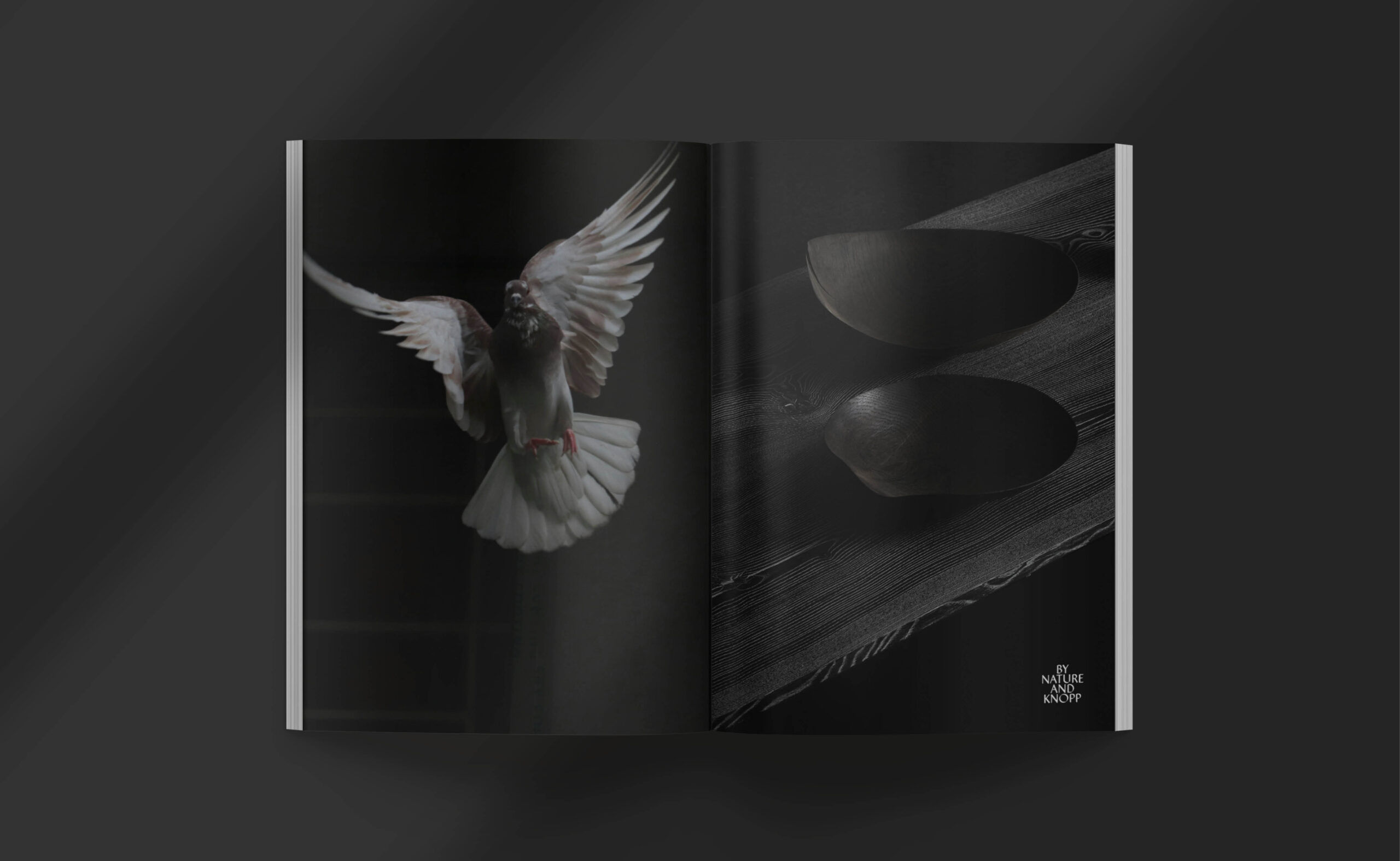
The work has continued to evolve. Table du Monde extended the brand logic into a new conceptual territory. The most recent chapter is the campaign for NOA — the new collection — under the line Pure Forms. Nature has spent millions of years perfecting its language of form. The campaign makes that argument visually: each spread pairs a form from the natural world — the curve of a whale’s tail, the shell of a tortoise, a bird mid-flight, the geometry of a honeycomb, the grain of sand shaped by wind — with the surface and form of a Knopp piece. Not illustration. Not analogy. A visual claim that the intelligence behind both is the same. Photography by Karl Paul Baldacchino.
THE SHIFT
What began as a price list became a brand — not through the addition of visual sophistication, but through the construction of a language that could make the work’s actual intelligence legible to the person who would eventually live with it.
The catalogue a client receives before visiting the studio is already doing the work the objects will complete in person. The gap between document and thing has closed — because the document was built from the same attention that produced the thing.